
Above: Alternative UK poster for Parasite. Art by Andrew Bannister.
Whether or not you think it’s the best film of the year (it topped the Film Comment and Guardian lists, and came second in Sight & Sound and Cahiers du cinéma), I think by now it’s safe to say that Bong Joon-ho’s Parasite is the most significant film of last year and probably this year too. From its Palme d’Or win to its historic Oscar nominations, Parasite is to 2019 what Pulp Fiction was to 1994: an impossible-to-ignore global phenomenon and a brilliant work of art to boot. All great works of art inspire more great art and Parasite has been a gloriously fecund host for poster designers to feed off, inspiring ingenious commercial campaigns and fan art alike.
The original Korean poster—the first glimpse any of us got of this soon-to-be sensation back last April—was designed by Kim Sang-man, a film director (Midnight FM), art director (Joint Security Area), and composer, who started his career as a poster designer and is a contemporary of Bong’s.

As I wrote when I featured the poster in my ten best posters of 2019, “its placid yet ominous domestic scene, rendered undeniably creepy by the censor bars across the protagonists’ eyes—reminiscent of Kendrick Lamar’s Good Kid, mAAd City—featured half the major players (not least that boxy, modernist home, the ultimate star of the film) and a number of significant objects (the teepee, that ornamental rock, those legs...) without giving much of the game away.” One thing I didn’t register until quite recently is how the bars across the eyes are color-coded by family: black for the Kims, white for the Parks.
The design has been used with barely any changes, except for the text, all over the world:
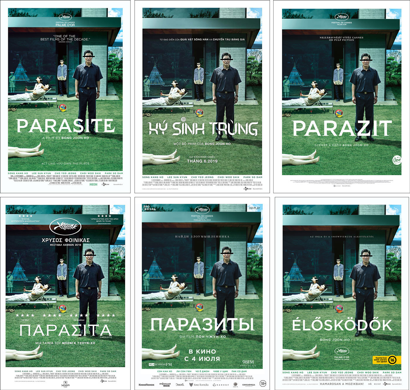
Above: official posters for Parasite from, clockwise from top left, the US, Vietnam, the Czech Republic, Hungary, Russia and Greece.
Andrew Bannister, who designed the superb reversible alt-poster at the top of the page for Curzon Artificial Eye’s U.K. release of the film (the U.K. will be notably one of the last territories to open the film, on February 7) also adapted the original key art for the U.K. quad poster which required some deft Photoshopping of walls and shrubbery.

If the U.K. will be one of the last countries to open the film, France was one of the first, opening it two weeks after the Cannes premiere and a week after the South Korean release. The main French campaign is as equally striking as the original, retaining the concept of the black censor bars (without the color coding, though the families are differentiated by being barefoot or in shoes) and including the entire main cast (with two notable exceptions) and placing them in the interior of the house but with two of the key signifiers of the film (the teepee and the ornamental “scholar’s” rock) still visible.

There are a number other French designs on the web, which seem to me to be leaked comp designs. All are very striking if somewhat more conventional than the family portrait above, and none use the black bars which have become the film’s most notable symbol (as well as an early festival gimmick).

Of all the French variants, however, this one got the most attention on social media...

...until the French distributor—the aptly named The Jokers—revealed that the poster was made as a parody of French comedy posters, citing this montage as evidence...

The Jokers did however officially release this stunning alternative art poster from Canadian artist Marie Bergeron, one of the first pieces to foreground the film’s architecture as well as highlight the upstairs/downstairs, high/low class dichotomy which is only hinted at in the French poster’s clothing choices.

For the French Blu-ray release of the film they commissioned this superbly detailed rendering of the Park’s house by Korean artist Jisu Choi.

It is the architecture of the Park’s house, with its grids and symmetries and hidden spaces, that has inspired the best art for the film, not least Curzon Releasing’s other great piece of alternative art for the U.K. release, designed by the geniuses at La Boca. This colorful marvel, which reminds me of the work of both Joost Swart and Chris Ware, contains nearly every sign and signifier from the film (peach, arrow, teepee, toilet, self-portrait, scholar’s rock, pizza box, dead body) while being devoid of human life (with one sneaky exception). The master strokes of this masterpiece are the matching staircases leading you out of the poster (into the void), the Morse code hidden in the light fixtures, and the Oscar under the table, especially given that this poster was released a week before the Oscar nominations.

Back in the States, Neon also released alternative art for the film, giving away these beautiful posters by artist Greg Ruth at early screenings of the film...

And these two suseok-centric designs below popped up online in October, though I’m not sure if they were ever printed and I’ve still not been able to discover who the artist was.

Mondo released their own Parasite poster back in October, created by the superb Winnipeg-based artist Randy Ortiz:

And one of my favorite pieces of Parasite art was this illustration for the New Yorker by the L.A. based Filipino-American artist Leonardo Santamaria:

Which brings us to the fan art for the film, of which there has been an astonishing amount (one day Parasite might rival The Shining for the film with the most inspired and varied fan art). I’ve featured some of my favorite pieces below.

Above: Parasite fan art by Portuguese artists Vicente Niro and IgorMade It.

Above: Parasite fan art by Joseph Roman (left) and Aleksander Szczepaniak.

Above: Parasite fan art by Boryana Ilieva aka Floor Plan Croissant, who has created extraordinary architectural watercolor artwork for numerous films.

Above: Parasite fan art by bearjew 416.

Above: Parasite fan art by maze artist Sean C Jackson.

Above: Parasite fan art by Charlie Bowater.

Above: Parasite fan art by Naomi.

Above: Parasite fan art by Tres Corderos.
If I’ve missed any other significant pieces of Parasite art, let me know in the comments below.