
1. Cosmos
Adam Maida’s silent scream for Andrzej Zulawski’s swansong Cosmos is a poster that cries out to be noticed. Channeling the starkest of Polish poster design—think Mieczyslaw Wasilewski or Andrzej Pagowski—Maida’s design is as deceptively crude as it is beautifully executed. I love everything about this poster, down to its hand-lettering, that tiny hanged bird and the even tinier—nice if you can get away with it—billing block. Maida’s witty, diagrammatic work has already graced Criterion covers for Nagisa Oshima’s Death by Hanging, John Frankenheimer’s The Manchurian Candidate, and Costa-Gavras’s The Confession and State of Siege, but it is his eye-catching black-and-white editorial illustration/montages for the New York Times that this most reminds me of. You can see more of his work here.
2. The Handmaiden

Trees and a hanging also feature heavily in my second favorite poster of the year: an exquisite piece of work for Park Chan-wook’s erotic costumed romp The Handmaiden. Designed by Empire Design—I’ve been trying without success to find out the identity of the illustrator—it was used, in slightly varied forms, in both South Korea and in the US as a teaser poster, with most theaters displaying the more conventional photographic portrait of the main players for the theatrical release. Which is a shame because this detailed illustration works even better seen large and up close (see it large here). With its delicate and arcane illustrations painted on what looks like a background of gold leaf, the poster perfectly mirrors the opulence and intrigue of the film itself. But what is intriguing to me are the subtle differences between the Korean and American versions: the hanging/hanged woman, the vanishing cherry blossoms, and that one character substitution (look for it) especially for the American market. Update: both posters were designed by John Calvert at Empire Design with illustrations by Rob Cheetham.
3. Moonlight

A poster as luminous and as haunting as the film it represents. Designed by major L.A. film marketing studio InSync Plus, the one sheet for Barry Jenkins’ justly lauded coming-of-age story conjures up one face out of the three ages of Chiron, Moonlight’s beleaguered protagonist: a Photoshop task no doubt much more difficult to pull off than it looks. With its eccentric and electric palette of purples and blues, this poster feels as if it is staring into your soul.
4. Paterson

I’d have to be honest and say I’m not crazy about the American poster for Jim Jarmusch’s Paterson, but I adore the German poster. I have no idea who designed it, but its pastiche of WPA-era National Parks posters for a film that is most specific about location (albeit not one that the WPA would have commissioned a poster for) is perfect.
5. De Palma

The poster for Noah Baumbach and Jake Paltrow’s loving portrait of Brian De Palma was illustrated by Steven Chorney, one of the classic ’80s movie poster artists, best known perhaps for Labyrinth. Chorney has recently found himself in demand once again creating the retro-looking campaigns for Paul Thomas Anderson’s Inherent Vice and Hot Tub Time Machine 2. In De Palma, the auteur reflects upon his career as America’s greatest poet of voyeurism, so it is fitting that Chorney has him peering through venetian blinds at glimpses of his greatest hits.
6. Dekalog

As rich and expansive and populated with characters as Krzysztof Kieslowski’s legendary 10-hour, 10-part Polish TV epic is, the stark-as-bones poster for Janus Films’ re-release of the Dekalog might seem like an odd aesthetic choice. But take a look at the earlier work of designer Anthony Gerace and it starts to make perfect sense. Gerace works with collage and found images, but is much enamored of grid systems. Any of his recent series There Must Be More to Life Than This would have been a good jumping off point for illustrating the Dekalog, but that he chose to pare down his architecturally ornate and colorful style to ten black squares in the sort-of shape of a crucifix was just genius.
7. Obit

Another rather elemental black-and-white design, the poster for this as-yet-unreleased doc about the New York Times’s obituary writers has the best use of empty space I’ve seen since last year’s The Lobster. Again, it is one of those posters where every element feels right, from the oversized half-tone dots of the face at the top, to the unusual layout of the billing block, to that definitive period after the title. Update: the designer is Kristin Bye who is also the film’s editor.
8. Christine

Brandon Schaefer (aka SeekandSpeak) may be the hardest working man in movie poster design. On top of being the co-host of the excellent movie poster podcast The Poster Boys, he designed some 50 new posters this year, a feat which would put him in the league of the great French movie poster artists who created some 2,000 posters over the course of their careers—assuming he can keep up that pace for the next four decades. My personal favorite of his work this year would have to be his Bass-esque poster for Theo Who Lived. But since I art directed that poster with Brandon for Zeitgeist Films, propriety propels me to go with my second choice, Christine—a film for which he produced not one but two finished posters: one for Sundance and the other for the theatrical release. The second is slightly more conventional, but those color bars either side of the bank of monitors are quite lovely. For good measure, he also designed the poster for Robert Greene’s riff on the same tragic story: Kate Plays Christine.
9. The Ornithologist

Scroll through this page and you’ll notice the importance of eyes in movie posters, not least in this stunning Japanese one sheet for what the New York Film Festival called João Pedro Rodrigues’s “bracing exercise in queer hagiography.” Given the title, this poster—designed by Igor Ramos and painted by Philippe Morin—might be seen, unlike the Portuguese version, to be a little too literal, but who could resist that owl? Talk about staring into your soul.
10. Dearest Sister

Now that Jay Shaw is the creative director at Mondo he sadly has less time than he used to to design movie posters himself. But that didn't stop him whipping up this ethereal masterpiece for Mattie Do’s Laotian horror movie Dearest Sister this year. Jay also art directed and lettered Rory Kurtz’s incredible Mondo poster for The Graduate which is probably my favorite art poster (or call them what you will) of the year.
* * * * * * * *
2016 may not have been the best of years in so, so many ways, but it was a pretty good year for movie posters. Last year my year-end round-up was reblogged on a more populist site and the first comment was “Literally nobody saw these movies.” That wasn’t true of course—especially not for readers of this column—but I got the point. To be honest, even I haven’t seen even half of the films on this list. But these posters made me want to. Of course smaller films—indie, foreign-language, documentaries—not only need the extra attention that a great poster can provide, but also more creative risks can be taken in marketing them. Hollywood has paid attention to the Mondo/fan-art phenomenon—which has led to a noticeable appreciation for illustration and design—at least to the extent of occasionally commissioning alternative posters or teasers for their major releases (check out the slew of brilliant alternate posters recently created for Nocturnal Animals). But when push comes to shove, the main theatrical one sheet for big budget movies always seems to have been designed by committee. That is not to say that they don’t do their job in selling the film—and often do it with a modicum of elegance and wit—but the final poster rarely stands alone as a work of art, as I believe many of these do so well.
RUNNERS-UP
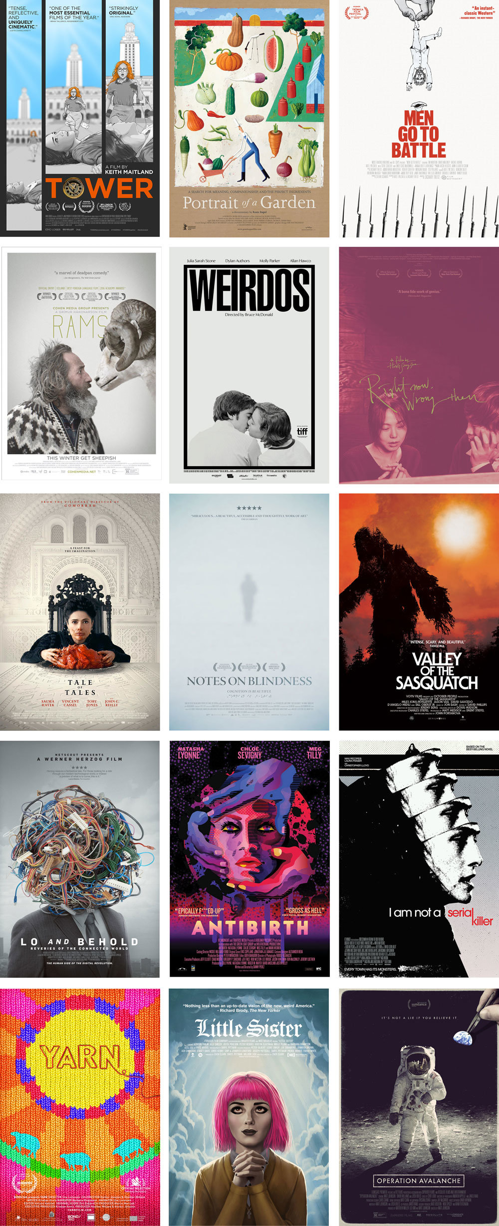
Posters above designed or illustrated by Yen Tan and Craig Staggs (Tower), Martin Jarrie (Portrait of a Garden), Teddy Blanks and Parke Custis (Men Go to Battle), Michael Boland (Rams), Midnight Marauder (Weirdos and I Am Not a Serial Killer), Propaganda (Right Now, Wrong Then), Adrian Gio Lopez at P+A (Tale of Tales), Brandon Schaefer (Notes on Blindness and Valley of the Sasquatch), Steven Smith at P+A (Lo and Behold), Webuyyourkids (Antibirth) and Akiko Stehrenberger (Little Sister). If you know who designed the posters for Yarn and Operation Avalanche, please let me know.
You can see previous Best of the Year posts here: 2015; 2014; 2013; 2012; 2011; 2010; 2009.
If you’re new to this site, do check out my regular Movie Poster of the Week posts on MUBI and you can follow me on Tumblr or Twitter. Happy Holidays!