
This beautiful poster for Xan Cassavetes’s vampire yarn Kiss of the Damned, which opens in theaters today, was designed and illustrated by Akiko Stehrenberger, whom I interviewed in 2010 after having selected her Funny Games poster as my favorite movie poster of the last decade.
I asked Akiko recently if she would choose ten of her all-time favorite posters to share with us, to give us an idea of her influences and aesthetic leanings, but first of all we spoke about the inspiration behind this delightfully retro poster. She told me how she was definitely inspired by the work of the great American poster illustrator Bob Peak (1927-1992).

“I took notes from his Petulia and Funny Girl, where things fall away to white and become a simplified graphic element. This falling away to white technique, I also incorporate into my own personal portrait work.”

“I also took a big lead from this 1970 Dorian Gray poster by Ted Coconis. Since Kiss of the Damned felt very late 60s and 70s influenced, and the main characters struggled with their inner demons, I felt it would be a good fit to touch on this duality in an interesting way.”

A commenter on Twitter also noted an influence of the 1969 poster for The Illustrated Man by Ferrini.

Akiko said that a version of that poster almost made her Top Ten and that she had had an understandably hard time winnowing her favorites down to just ten.
Her choices are presented in alphabetical order, but it makes sense to start where we do because, when Akiko was invited to speak on a movie poster panel at SXSW in 2011, the panelists were asked to bring along one poster of their own that they were most proud of, and one poster by another designer that they loved. And this was the poster she chose:
Japanese poster for Apocalypse Now (Francis Ford Coppola, USA, 1979) designed by Eiko Ishioka with artwork by Harou Takino

“I love how the illustrator created a beautiful and surreal painting based off just the one scene where Robert Duvall says ‘Charlie Don't Surf.’ Its beauty lies in the painting technique and the composition which takes great advantage of the horizontal format. Starting at the right top corner with the helicopters, your eye can't help but follow the swoop of the wave that leads you to the title in the bottom right corner. Everything is so well considered design-wise even to where the surfer is a second read although perfectly centered.” [Click on the image to see in all its glory.]
1988 Polish re-release poster for Blow-Up (Michelangelo Antonioni, UK/Italy, 1966) designed by Waldemar Swierzy

“I love this version of Blow Up, because I can’t imagine the process of the artist figuring this out in the pre-digital age. I'm a big fan of Polish posters because they're experimental and intriguing. Even if I don't understand the concept, the technique draws me in to want to. As a whole, Polish posters influenced me heavily because of their hand-done, almost naive unpolished look. I like seeing the hand behind the art, happy accidents and all.”
US one sheet for Downhill Racer (Michael Ritchie, USA, 1969) designed by Stephen Frankfurt/Philip Gips

“I've always loved the clever use of negative space, the torn paper technique, and the fact that it wasn’t crucial to have Robert Redford’s clear likeness in the poster.”
US one sheet for Kaleidoscope (Jack Smight, UK, 1966) designed by Bob Peak

“There are too many Bob Peak posters to chose from because I look up to him the most out of all movie poster illustrators/designers. I chose this poster because not too many people know about it. I love his curation of photo with illustration and his use of color.
“In general, I admire that Bob Peak’s work was stylistically versatile. He could go feminine or masculine, could adapt to different genres rather than pushing a signature style every time, but still maintained a distinct point of view. I find this a big influence in my work as my approaches differ per project, but I hope there’s an invisible linear thread between them all. Since I am both an art director and illustrator, it’s important to determine which style is appropriate because this communicates just as much as the actual content. Sometimes the illustration style is the concept. As much as we movie poster designers love to push art into a poster, we still have to be respectful to the marketing. It’s important to sell the film appropriately first before trying to push one's own style, or else we aren't doing our job adequately.”
French grande for Lolita (Stanley Kubrick, USA, 1962), designer uncredited, based on a photograph by Bert Stern

“The simple clash of Sue Lyon’s sexy look with a little girl's lollipop gives you the gist of the film without hitting you over the head. I am not quite certain whether this poster is an illustration or a heavily techniqued photo*, but that’s what I love most about it.” [*I always wondered exactly the same thing about Akiko’s Funny Games poster until she set the record straight.]
UK poster for The Man Who Fell to Earth (Nicolas Roeg, UK/USA, 1976). Artist uncredited

“I am biased because I grew up loving David Bowie, especially from this era. I love how the painting technique has variations from an opaque to a more watered down gouache approach. I try to achieve these looks when I work with acrylic.”
US one sheet for Pale Rider (Clint Eastwood, USA, 1985). Artwork by C. Michael Dudash

“I like how beautifully executed this is because of its watered down gouache technique, the monochromatic dust-like color without feeling dirty, and its sparse composition.”
German poster for Pickpocket (Robert Bresson, France, 1959) by Hans Hillmann

“It made me think it was the point of view from the inside of a pocket. Now that I really look at it, it really could just be a hand between two people. Regardless, I admire the concept and the layout’s simplicity.”
US one sheet for Straw Dogs (Sam Peckinpah, USA/UK, 1971), designer uncredited

“I think at one point every designer has tried to do something like this. I tried to do this for my unused version of The U.S. vs John Lennon when I first started in my movie poster career. I put real flowers where his glasses were over a photo. But after Tyler Perry’s I Can Do Bad All By Myself directly ripped off Straw Dogs, and the remake of Straw Dogs did a bad version of it, any attempts at doing something too similar can officially be put to rest.”
UK quad for Yellow Submarine (George Dunning, UK, 1968) by Heinz Edelmann
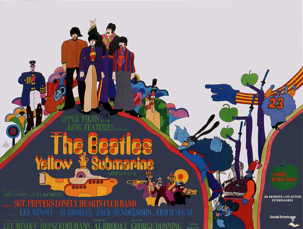
“I love psychedelic art from the 60s and 70s. Yellow Submarine had to have been an illustrator's dream come true. Whenever I feel something too colorful can look too tooty fruity, I remind myself of how wonderfully Heinz Edelmann, Peter Max, and Milton Glaser utilized color.”
Many, many thanks to Akiko. You can see more of her own work on her website.