This month, MUBI Editions, in partnership with the Cinématheque Française, is publishing an extraordinary document: a cinephilic Rosetta Stone known as “The Faust Bible.” When, 100 years ago, director F. W. Murnau completed work on his final German film and his most ambitious one to date, members of his crew compiled a scrapbook of illustrations and photographs that documented the making of that film, bound inside a prop Bible, and presented it to Murnau as a memento of the production prior to his impending move to Hollywood.
Considered lost for many years, the Faust Bible was recently rediscovered and restored by the Cinématheque, and now MUBI and the Cinématheque have recreated this “stunning artefact of cinema history” and are publishing it under the title The Faust Bible: The Making of F.W. Murnau’s Masterpiece. Laurent Mannoni, Scientific Director of Heritage at la Cinémathèque française, who guided the restoration and publication of the book, writes:
One of the most influential and pioneering filmmakers of the silent era, F.W. Murnau was known for the privacy of his film sets. Reluctant to welcome visitors, he was even less inclined to reveal his creative process. The rediscovery of the Faust “Bible” offers extraordinary insight into the making of one of cinema’s great masterpieces. Published in its entirety for the first time, it allows readers to trace the creation of this legendary film.
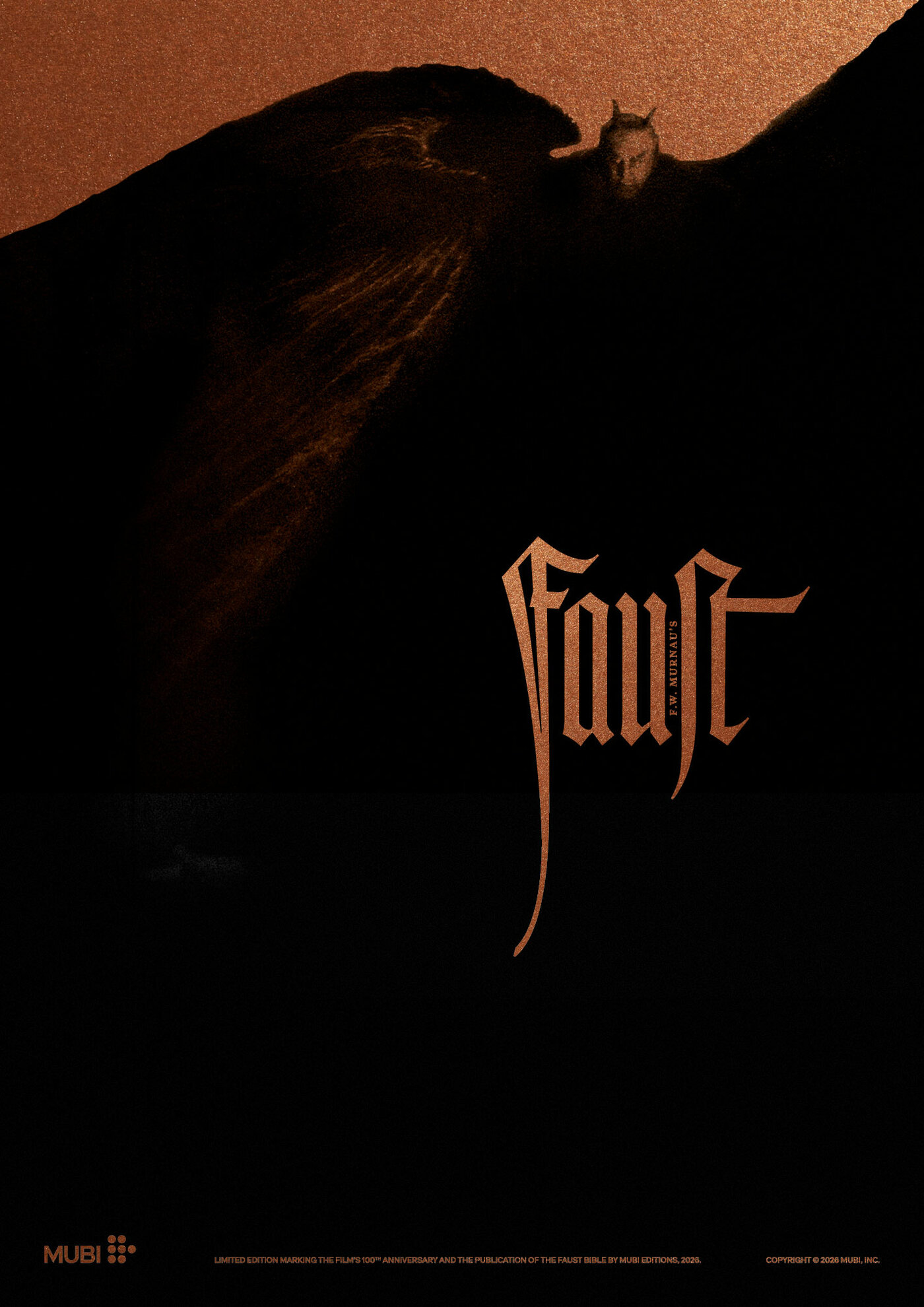
Alongside the book, MUBI has commissioned this gorgeous poster for the film, designed by MUBI Lab and printed in black ink on bronze paper with foil stamping on the title treatment. It will be released in a limited edition by the MUBI Shop. The Faust Bible: The Making of F.W. Murnau's Masterpiece was designed by Mathias Clottu and Valérian Charmasson for Studio Mathias Clottu. The Rudolf Koch letters featured on the cover and the poster were redrawn by Adrien Vasquez.
Posters play a significant part in the story of Murnau’s Faust. In mid-August 1926, after production had ended and a couple of months after Murnau had departed for the US, the producers at the studio UFA (Universum-Film Aktiengesellschaft) held a competition to design a poster for this most prestigious of films. In total, 359 designs were submitted, the winners were announced on September 20, and on October 12, the best of the designs were exhibited in the foyer of the Ufa-Palast am Zoo, Germany’s largest movie palace, two days before the film’s gala premiere. The winner of the first prize of 2,000 marks (equivalent to about $9,000 today) was the Berlin artist and printmaker Karl Michel (1885–1966), who by 1926 was already well known in artistic circles.
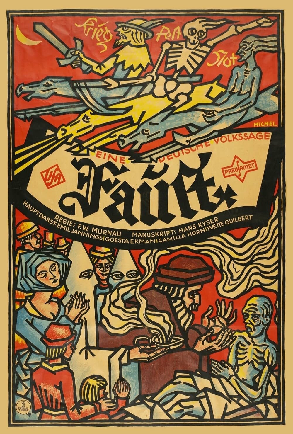
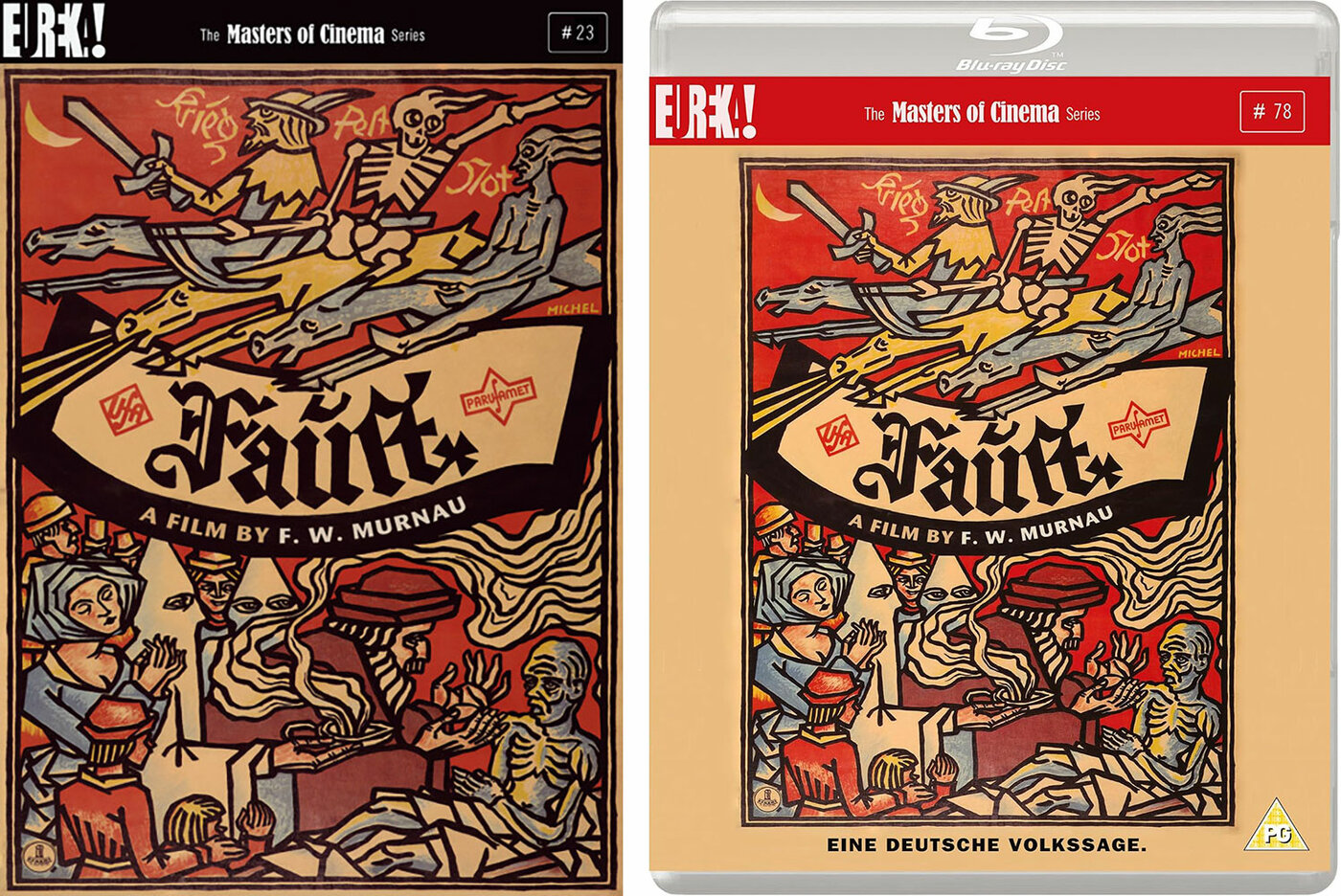
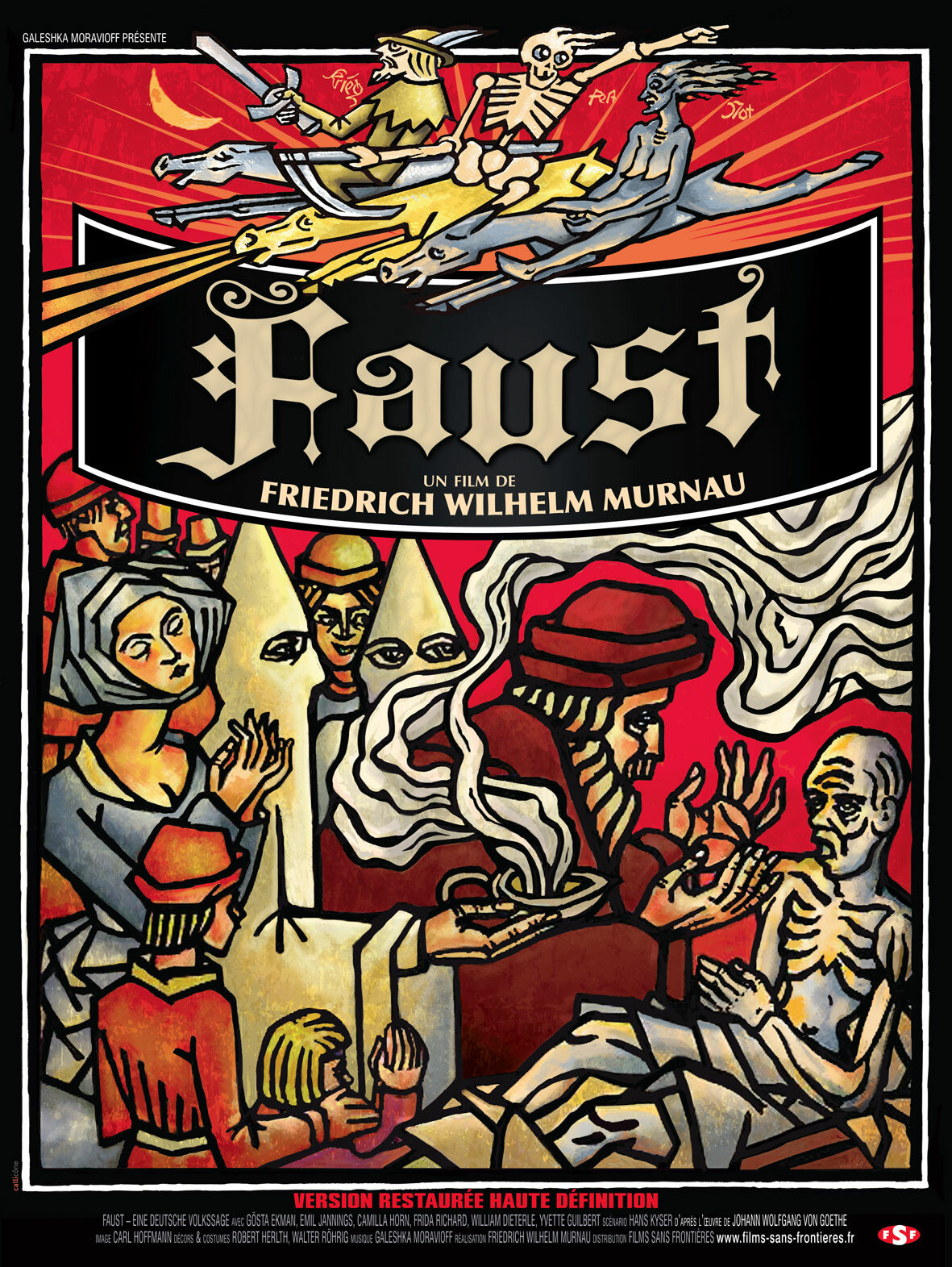
The poster, which measures 36” × 55” (almost twice the size of an American one sheet) is a thing of beauty and quite unlike anything else from that period. Painted in the style of a medieval woodcut it, nods to the sixteenth-century origins of the legend of Faust. It features Doctor Faustus reviving a dying man while a crowd watches and three horsemen of the apocalypse—War, Plague, and Death—gallop overhead. What it does not depict, surprisingly, is Mephistopheles, the Devil incarnate, unless he is supposed to be one of the hooded figures behind Faust. Mephistopheles, or Mephisto as he is known in the film, was played by Emil Jannings, one of German cinema’s great stars, so his omission is peculiar.
Michel’s poster is in the collection of the Museum of Modern Art and is widely regarded as one of the great movie posters (it has been featured in numerous MoMA exhibitions, from the landmark “Movie Posters” exhibition of 1960—which I wrote about in the first edition of Notebook magazine—through to “Weimar Cinema 1919–1933: Daydreams and Nightmares” in 2010). But it was not always held in such high regard.
On October 13, 1926, the day before the film’s premiere, the German trade magazine Film-Kurier wrote a most scathing article on the exhibition of the best of the submitted designs. The article started out very sympathetically while taking a swipe at the general state of movie poster design.
It should be noted that the idea of holding a public competition for the Faust poster was excellent. First, it provided an opportunity for good publicity, and second, it offered the chance to attract new and unknown poster artists for the film, which is urgently needed given the regrettable artistic and advertising-related low level of the majority of our film posters.
From there, it descends into a wholesale condemnation of the results, saying, “Seventy percent of the designs are undeniably amateurish” and “among the remaining images, there is not a single one that could be even remotely satisfactory.” It offered the caveat that “UFA is, of course, innocent of this deplorable fiasco” since “the subject matter was extremely appealing and the prizes were very high.”
Part of the problem seemed to be that a lot of fine artists and illustrators entered the competition without much or even any knowledge of film poster design and that, above all, the result was supposed to be a piece of advertising. Film-Kurier goes on to say that “apparently, the most headaches were caused by trying to fit in the text. Title, subtitle, the names of director, author, librettist, and four actors, plus two logos—that's a lot, but not an insurmountable task.”
Finally, they get to Karl Michel’s winning design—yet without mentioning the artist’s name anywhere in the article:
The first prize of 2,000 marks was awarded to a design that, in the style of an old woodcut, depicts a series of symbolic figures and scenes. It deliberately deviates from the usual movie posters, but that is pretty much its only merit. The actors’ names are completely relegated to the background; it can hardly be described as particularly effective. Add to that the bright yellow overprint, typical for Berlin, and the whole thing makes a highly unsatisfactory impression.”
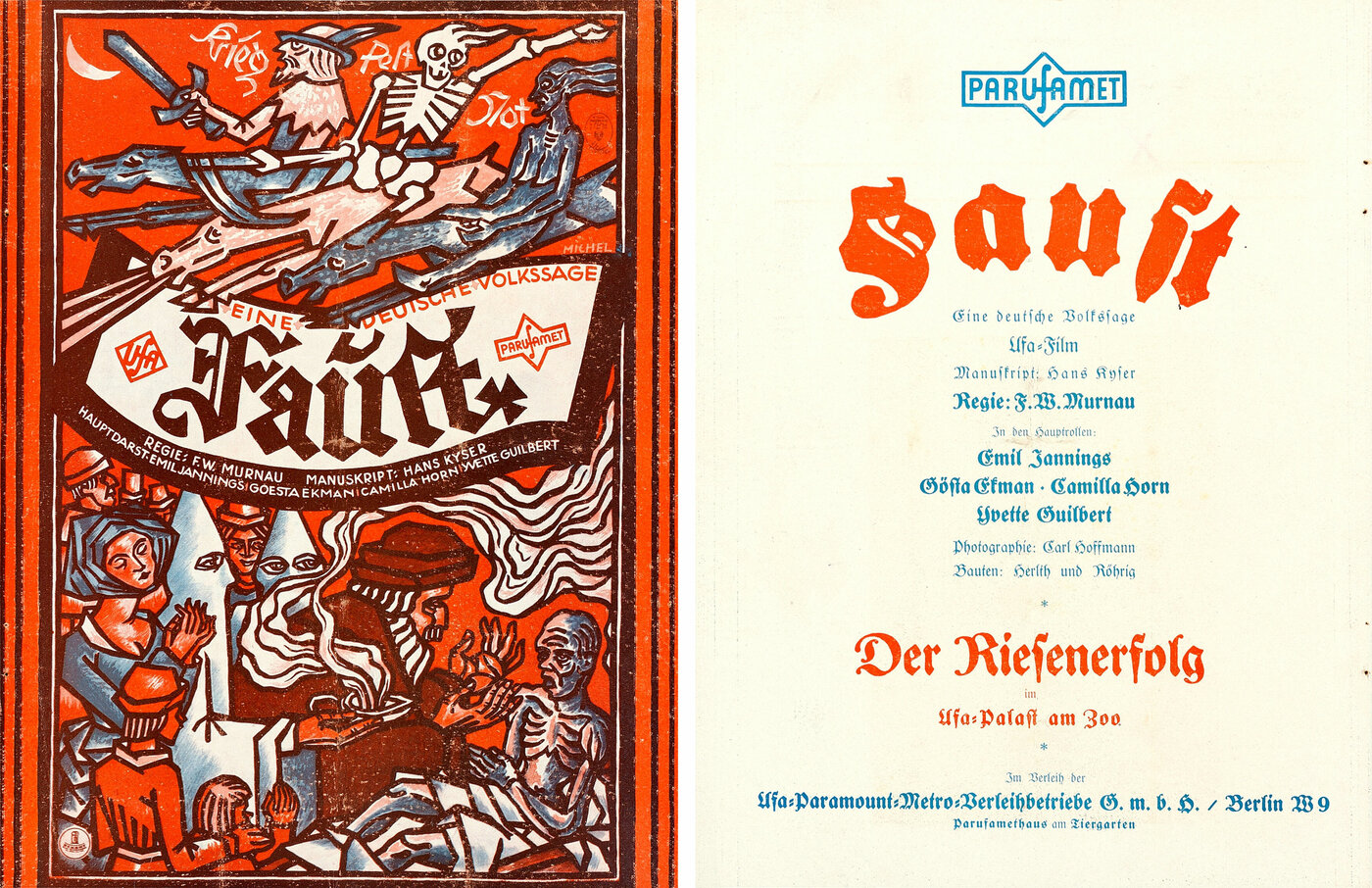
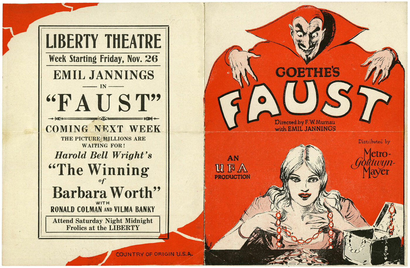
Despite Film-Kurier’s objections (which, surprisingly, did not include the omission of Mephisto), Karl Michel’s poster was used, at least initially, as the official German poster for the film. It was reproduced with different colors on the promotional flyer for the film’s opening (above) and it was also used, in a redrawn black-and-white outline version, on the inside cover of a 40-page booklet that was handed out at the premiere. The booklet, titled Worte zu Faust, contained the unused intertitles written by Nobel prize-winning poet Gerhart Hauptmann. Hauptmann had been asked to revise the existing intertitles but, after watching the film, ended up writing 700 lines of rhyming verse. When screenwriter Hans Kyser objected in an open letter to various newspapers that Hauptmann’s titles were too literary and “an unwarranted intrusion into the work of another artist,” they were abandoned, but to placate Germany’s most famous poet, they were printed in this booklet and disseminated at the screening. Note that Hauptmann’s name has been added to the credits on this version of the poster.
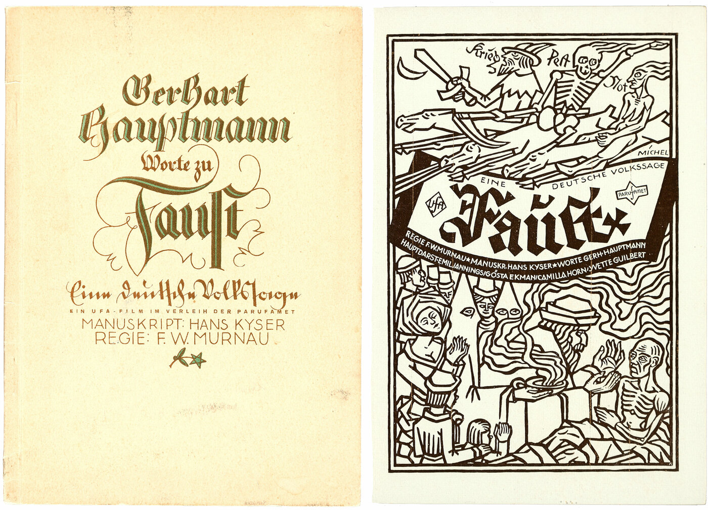
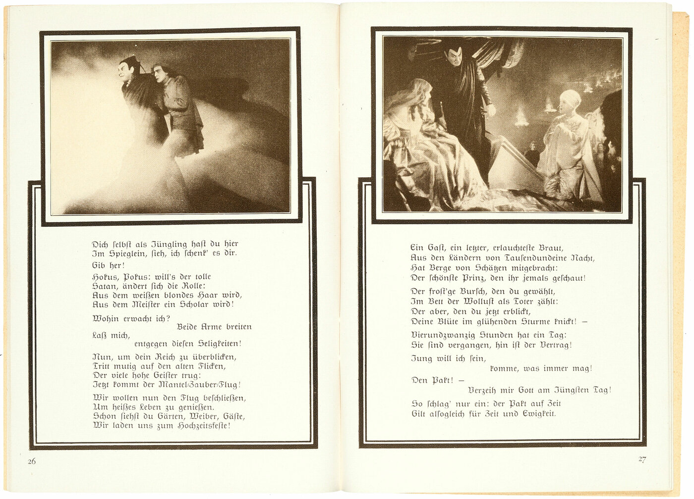
Another program for the film’s original release does, however, do away with Michel’s design and features Mephisto more prominently.
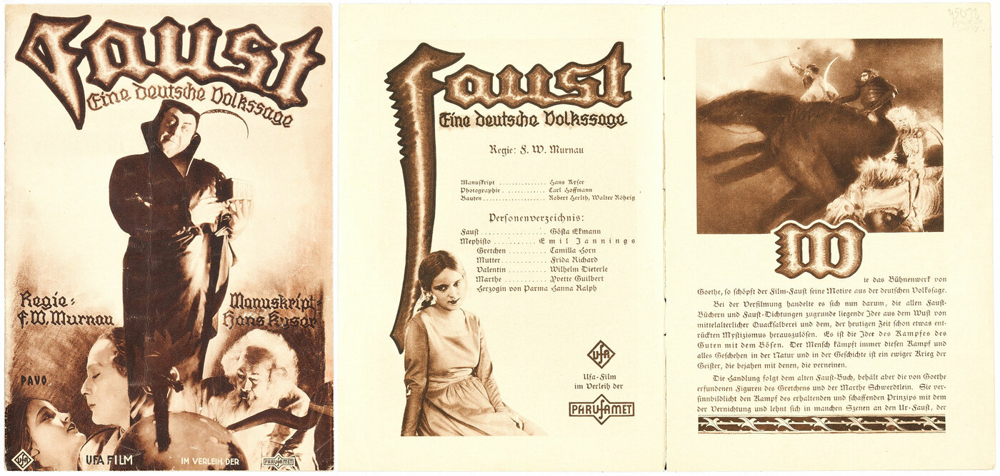
I wish we had photographs of the exhibition, but I’ve been unable to track any down. It would be fascinating to see the other submissions. Film-Kurier gives us a hint of the runner-up, saying that “second prize was awarded to a poster featuring the heads of Faust and Mephisto—both well-executed—but a poorly rendered Gretchen.” It would seem to be this poster that is signed by one Kurt Lange.
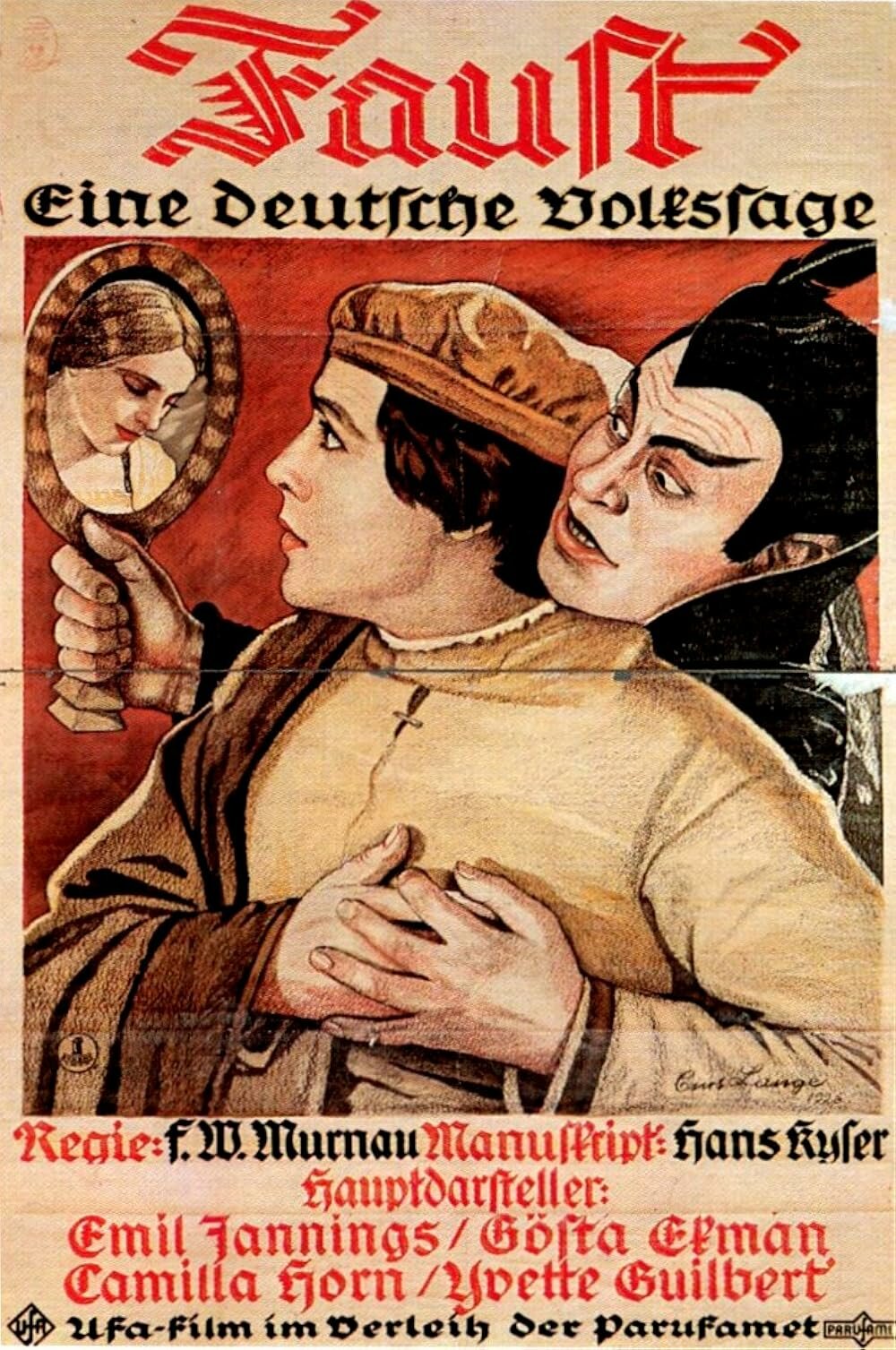
I found a 1928 article on Lange from the magazine Die Kunstschule – Illustrierte Monatsschrift für Kunst und Kunstpflege (The Art School – Illustrated Monthly Magazine for Art and the Cultivation of Art), which says that Lange was born in Berlin on February 25, 1898, and that he worked as a painter and also designed several film posters. The article mentions that Lange’s design for Faust won third, not second, prize in the UFA competition. And it includes an alternative poster for Faust and a study of Jannings for the poster above.

Here is another German poster for the film, unsigned by its artist.
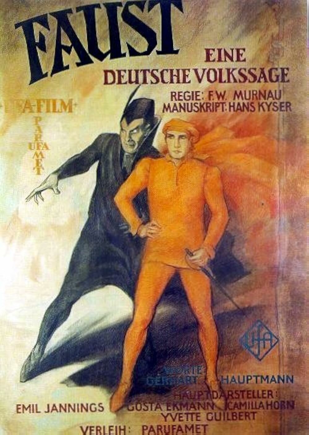
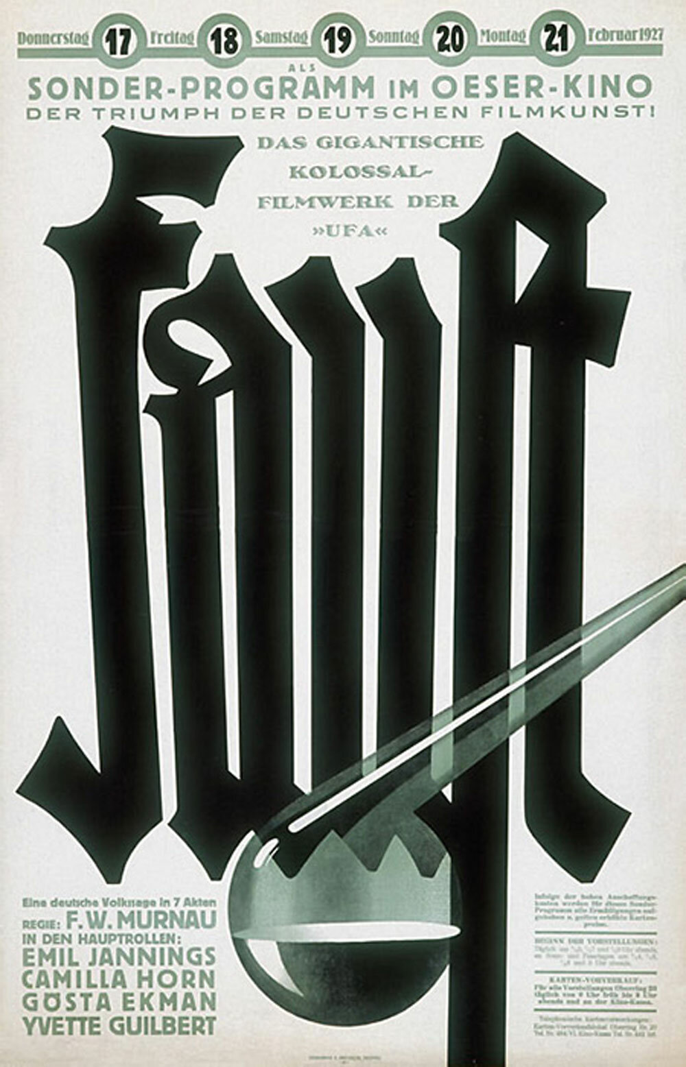
And maybe this below—which was used to advertise a screening at the Oeser-Kino in Vienna in February 1927—was adapted from the third (or was it second?) prize-winner, which Film-Kurier said “gives typographic posters their due.”
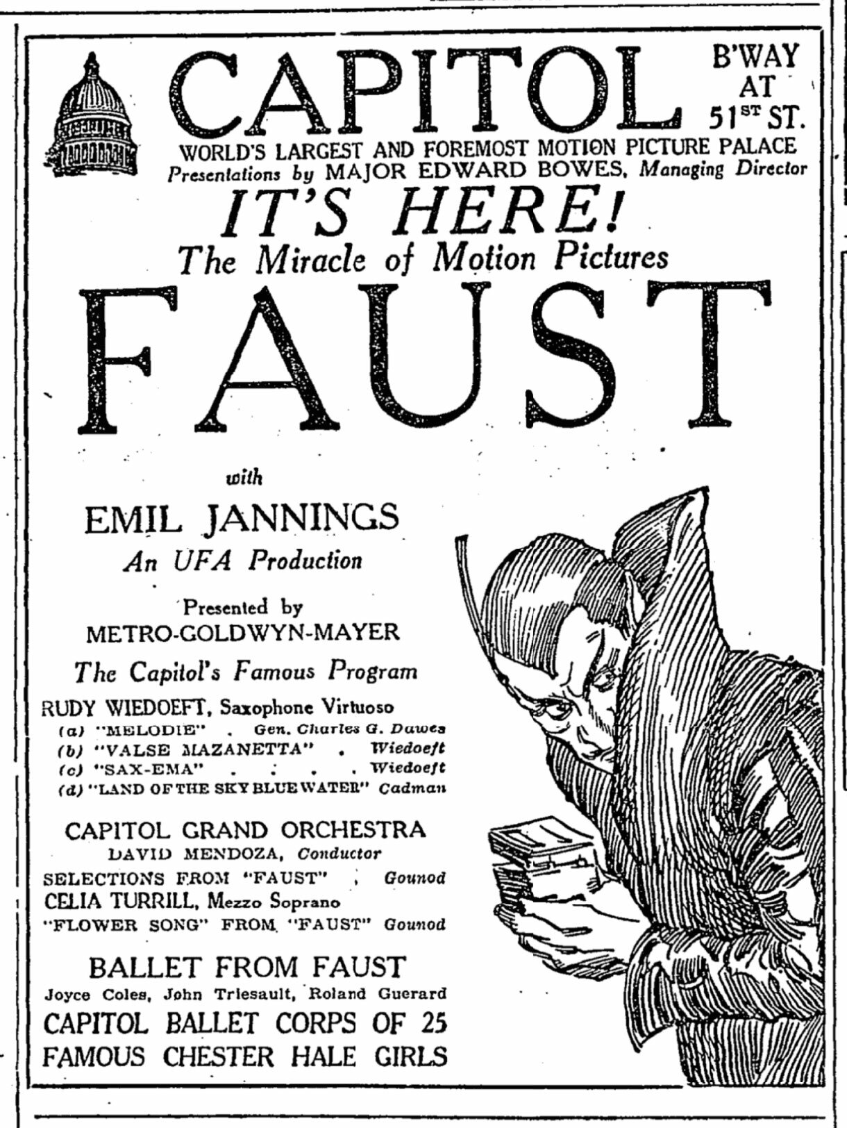
Faust opened in New York on Sunday December 5, 1926, less than two months after the German premiere, and the same day as Sergei Eisenstein’s Battleship Potemkin (then known as Armored-Cruiser Potemkin). It played for two weeks at the Capitol on Broadway and 51st St., advertised as the “world’s largest and foremost motion picture palace.” Here is the New York Times opening ad:
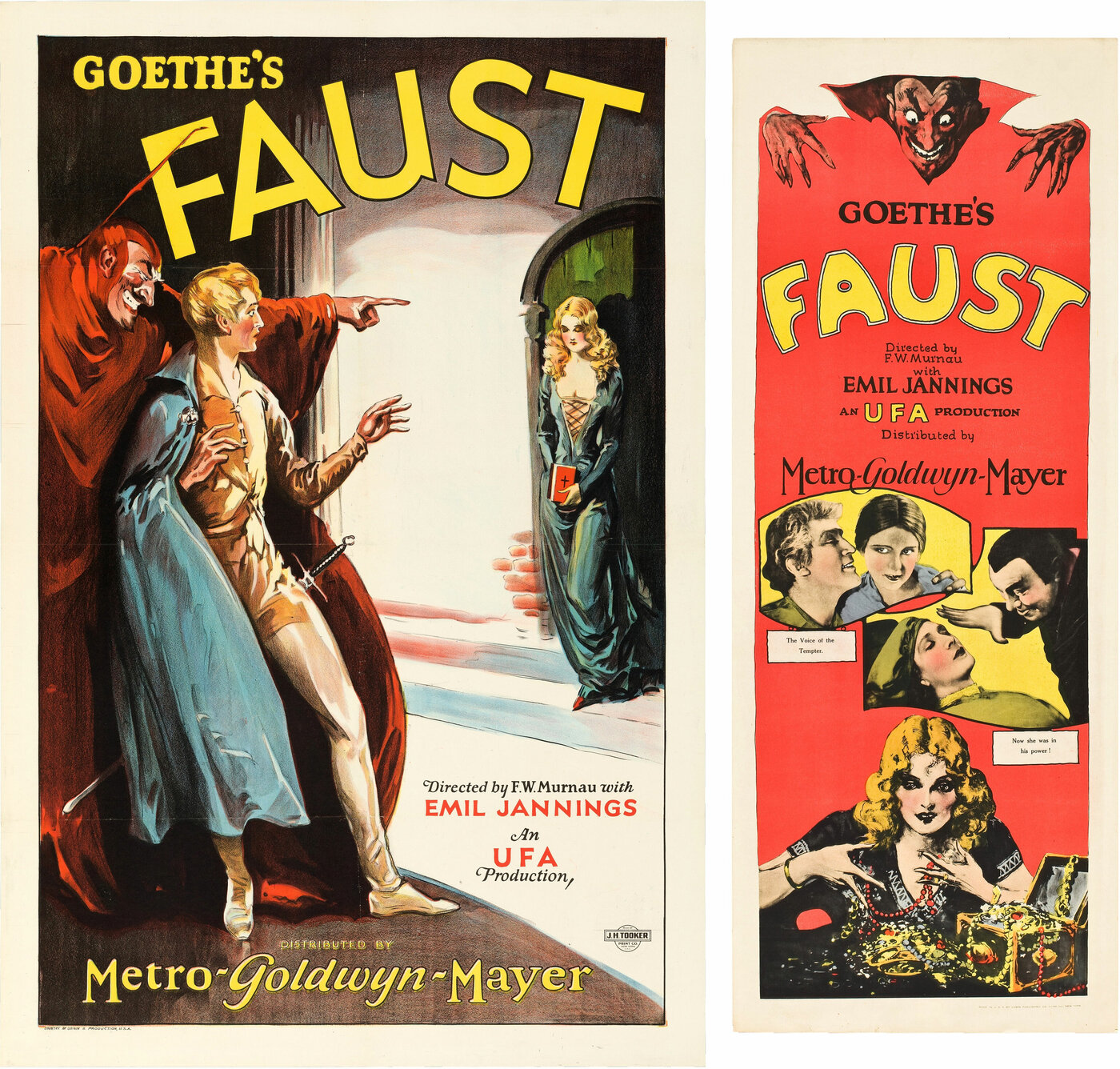
The American posters for Faust leaned in heavily to Mephistopheles, though he is rendered far more cartoony and does not at all resemble Emil Jannings’ portrayal (Jannings’ Mephisto is clean-shaven). Here is the 1926 US one sheet and insert poster at their relative sizes (artists unknown):
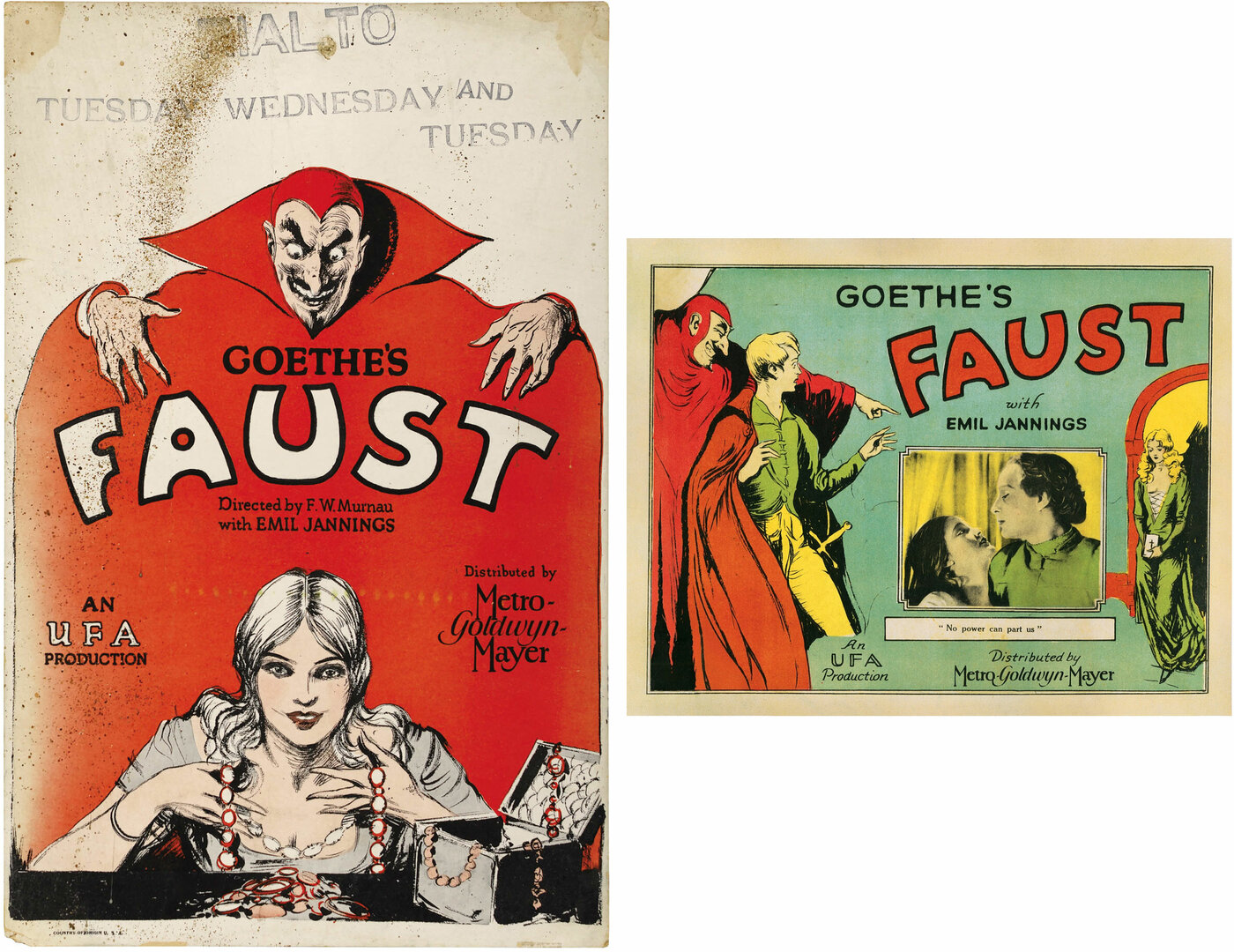
And here is a window card and lobby card:
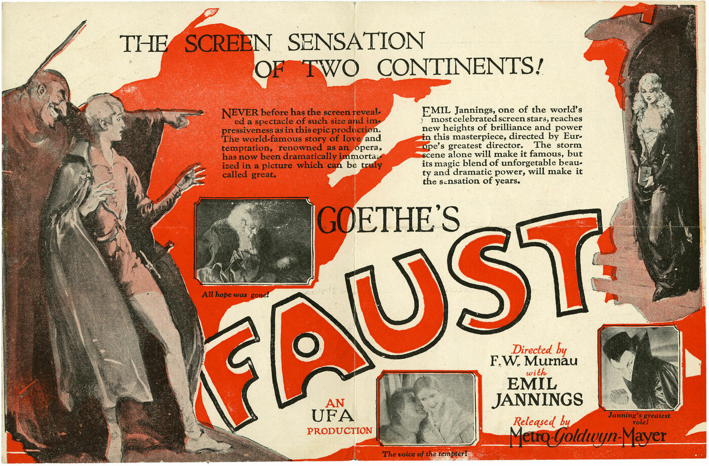
And finally, the front and back of a herald flyer for the film, which incorporates a lot of the elements from above.
In 2006, 80 years after the original release, the UK label Eureka’s Masters of Cinema resurrected the Karl Michel art on the cover of their DVD release and did the same for their 2014 Blu-ray release.
It was also used for the theatrical poster for a French rerelease of the restored film.
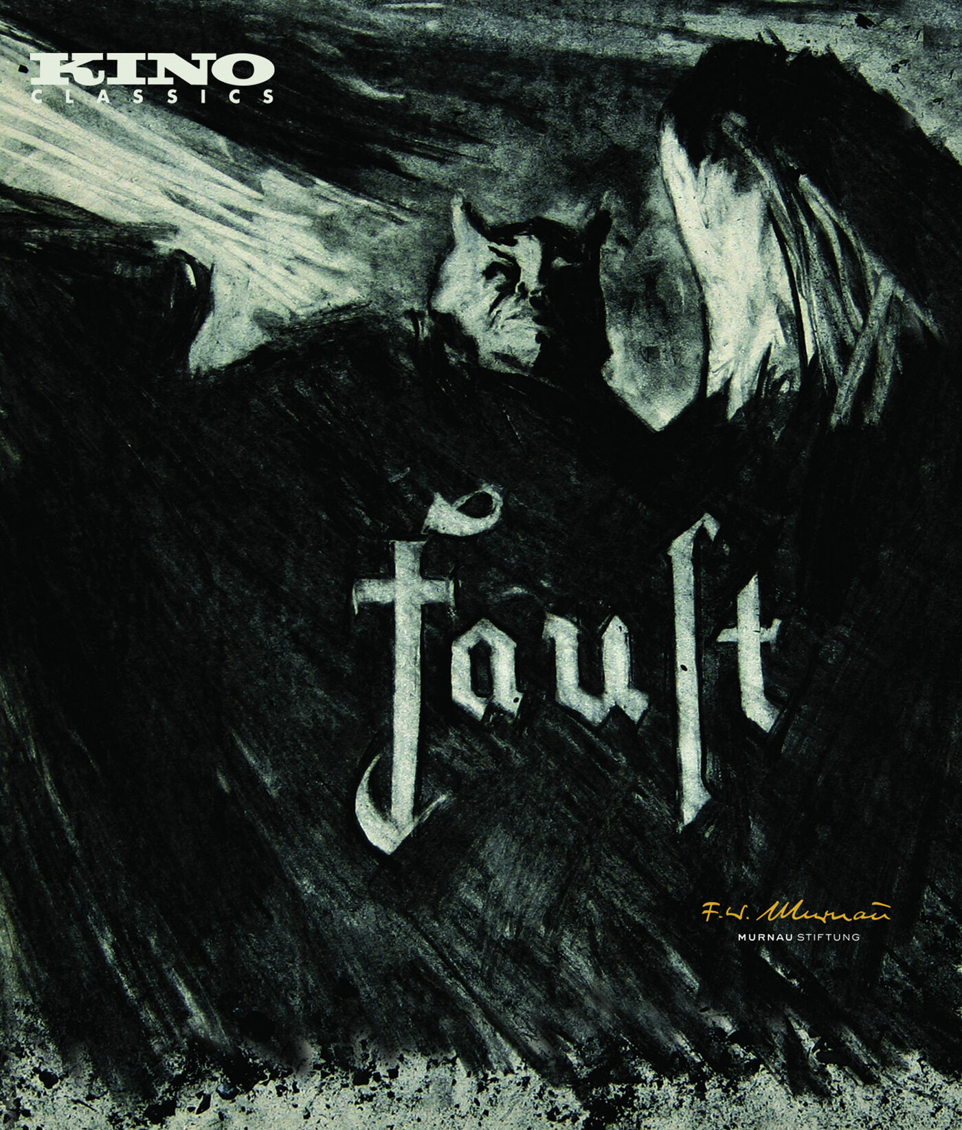
In 2015, Kino Lorber released a fully restored version of the film on Blu-ray with art that uses one of the most dramatic and iconic scenes from the film, strangely ignored by earlier poster designers, of a gigantic horned Mephisto looming over the city, an image stunningly repurposed in MUBI’s new poster.
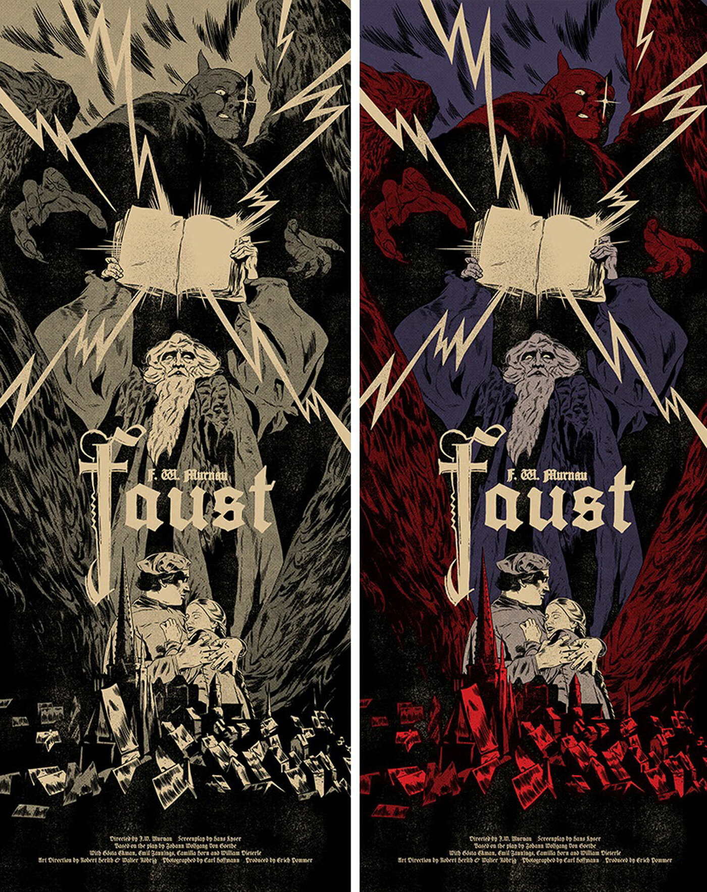
A similar image was used in 2020 for Johnny Dombrowski’s tribute posters for Mondo and Black Dragon Press.
For 100 years, Murnau’s Faust has proved to be a rich source of design inspiration, despite what a contemporary trade magazine might have said. The Faust Bible gives us a comprehensive look behind the scenes at this marvel of silent cinema and into the mind of one of its geniuses.