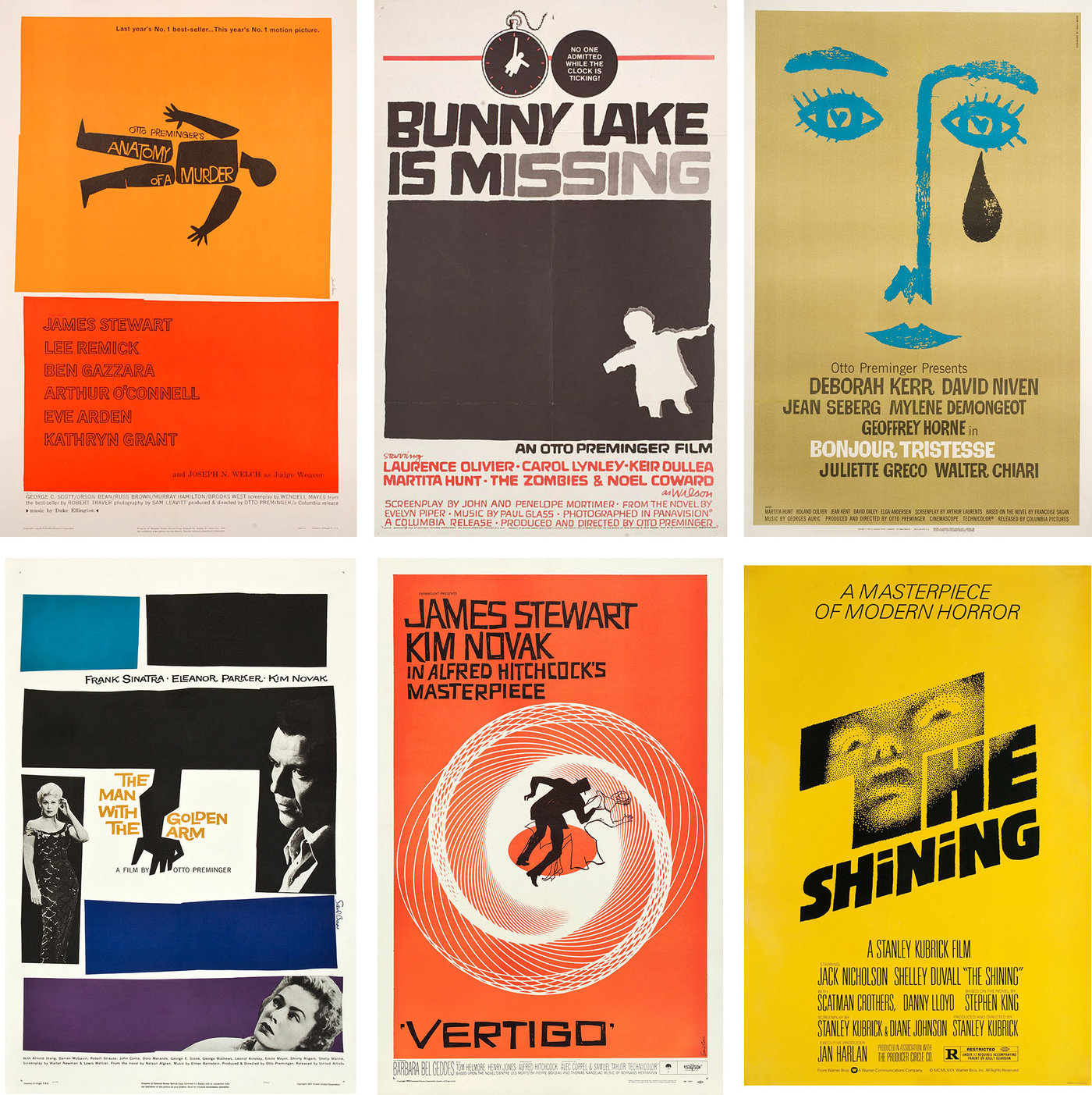
The great Saul Bass—to my mind the greatest graphic designer of the 20th century—was born 100 years ago today, on May 8, 1920. In over a decade of writing about movie posters I’ve only really written about Bass once—in an article about the evolution of designs for Vertigo—which is surprising because he was undoubtedly the first poster designer I ever knew the name of, and of the six movie posters hanging in my apartment (which, contrary to what you might think, is not covered in posters) two are by Bass: those for Seconds and The Man With the Golden Arm. Saul Bass is just too well known, and has been written about so widely, that I never felt I had much to add to the discussion. And when Jennifer Bass and Pat Kirkham’s extraordinary Saul Bass: A Life in Film & Design (over 400 pages and 1,400 illustrations) was published in 2011 there seemed little more left to say.
But I can’t let this centenary pass unremarked. Bass’s work in film—his title sequences especially, but also his holistic approach to film branding—revolutionized film graphics. In an almost 60-year career he only made some 25 film posters that were actually used commercially (and at least ten of those were for Otto Preminger) but his most famous designs are so iconic and have been so consistently referenced and plagiarized in the half-century since they were made that his impact and reputation as a movie poster designer is unimpeachable.
Bass’s use of stark graphic elements, silhouetted and stylized bodies, swathes of empty space and blocks of bright color, was like a lightning bolt shot in the arm of movie advertising in the mid ’50s. Bass had been doing trade ads for film studios since the late 1930s, when he was still in his teens, and many of his magazine designs already had a freshness of approach that stood out in contrast to the more realism-based advertising of the time. He refined his style making ads for Stanley Kramer productions like Champion (1949), The Men (1950), and High Noon (1952), and in 1954 he shot his first title sequence, starting a fruitful collaboration with Preminger, for Carmen Jones. (In collaboration with his wife Elaine, Bass created some 50 title sequences over his career, the last one being for Martin Scorsese’s Casino in 1995, made the year before he died.)
From the mid ’50s through the mid ’60s Bass created campaigns for Preminger, Hitchcock, and Billy Wilder that practically define mid-century modernism in movie poster design. But despite the popularity of his work in film, he often found himself fighting the studios who wanted to tamper with his symbolism and muddy-up his clear-eyed abstraction. The photographic images of Sinatra, Novak, and Parker on The Man with the Golden Arm (1955)—one of his first realized movie posters—were added by the studio against Bass’s wishes. And so Bass would also make screen prints of his preferred version of his designs, as well as of designs that never saw the commercial light of day. In the late ’60s he also started to design posters for foreign films for distributors more willing to go with his bold designs. And at the same time he started to make his own short films and would design posters for those (though for some reason he never designed a poster for his one feature, the sci-fi horror Phase IV).
What follows are some of Bass’s lesser known works from that later period. All of these posters come courtesy of Film/Art Gallery in Hollywood which, in exclusive partnership with the Saul Bass Estate, offers much of Bass’s work for sale in their Saul Bass Archive.

Above: 1980s silkscreen print of an unused 1960 design for John Sturges’ The Magnificent Seven.

Above: 1980s silkscreen print of an unused 1966 design for John Frankenheimer’s Grand Prix.

Above: 1980s silkscreen print slightly pared down from Bass’s 1967 release poster for Claude Berri’s The Two of Us.

Above: 1980s silkscreen print of an unused 1968 design for John Frankenheimer’s The Fixer.

Above: Bass’s poster for his 1968 Oscar-winning short film Why Man Creates.

Above: Original silkscreen poster for the 1969 New York run—including showtimes!—of Yves Robert’s Very Happy Alexander.

Above: Although Bass rarely made posters for Hollywood films after the mid-’60s—The Shining (1980) being the most notable exception—he continued to work with Otto Preminger. This is the silkscreen version of Bass’s design for Preminger’s Such Good Friends (1971). Paramount added an additional image of a date book to the top half of the release poster.

Above: Original silkscreen poster for Preminger’s Rosebud (1975).

Above: Bass’s poster for his own short film Bass on Titles (1977).

Above: Release poster with Bass’s design for Preminger’s final film, The Human Factor (1979).

Above: Bass’s poster for his and Elaine Bass’s 1980 short The Solar Film.

Above: 1988 Bass design for a film that was never made.

Above: One of Bass’s last major commissions from a Hollywood studio was for Spielberg’s Schindler’s List (1993). Though his designs weren’t used for the final release poster they were test-printed on newsprint to see how they would reproduce as newspaper ads.

Above: Bass’s final poster design, for the 1994 Spanish film Cradle Song.
You can see a lot more film posters from the Saul Bass Archive here, as well as festival posters and other ephemera. Many, many thanks to Matthew McCarthy at Film/Art Gallery and Happy 100th, Saul!
