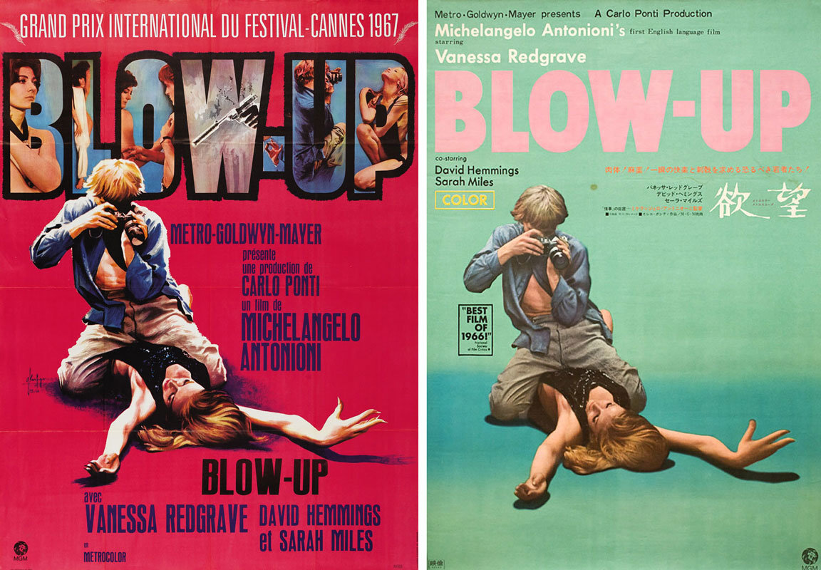
Michelangelo Antonioni’s Blow-Up—which opens today in a new restoration at New York’s Film Forum—is a film about images, photographs especially (a film whose obsession with film grain makes a hi-def digital restoration seem almost perverse). But if ever a film has been reduced to a single image in the public mind it is Antonioni’s mod masterpiece, whose shot of David Hemmings straddling super-model Veruschka at the climactic moment of an orgasmic photo shoot has become the movie’s money shot, endlessly parodied since. Veruschka (a.k.a. Countess Vera von Lehndorff-Steinort) appears for only five minutes at the beginning of the film but she, more than top-billed star Vanessa Redgrave, became the face, or rather the body, of Blow-Up.
The shot was used for both the French grande (painted by Georges Kerfyser) and the Japanese poster, above, as well as for a wonderful series of green, yellow and red Italian posters. It has since been used on the cover of nearly every home media release of the film too, including the new Criterion.

The U.S. one sheet, however, used a different shot of Veruschka being photographed—this time at a distance—by Hemmings, and the same image was painted by the great Ercole Brini for an alternative Italian campaign.

It was also used for the German release (initially titled Ekstase ’67), illustrated by Hans Braun, who also painted the post-coital scene below. The German campaign is also significantly the only one on which the German-born Veruschka is named.

The same image appears in the U.K. quad poster—surprisingly the least aesthetically pleasing design of all with its mishmash of typography (what's up with Vanessa Redgrave’s name?) and its slapped-together look.

But there was a teaser poster in the U.K.—perhaps the first design ever created for the film—that was far more graphically interesting, despite eschewing the sexiness that would become the film’s calling card (though what's going on with that title reversed in a film strip at the bottom?). Notably, red would become the color of so many of the film’s campaigns.

The Belgian and the Spanish designs diverge wildly from the Veruschka-centric campaigns, centering instead on one of the other Swinging Sixties models who appears briefly in a later sequence. The Belgian poster is drawn by Robert Detheux and the Spanish by “Rojo”. (Also of note is the bizarre Spanish subtitle which translates as “I desire a summer morning”.)

One other poster that was strikingly different from the Veruschka-centric campaigns is the U.S. three-sheet which put Vanessa Redgrave front and center. It was also one of the only designs that played with the idea of photographic reproduction and enlargement.

But there are four other notable exceptions to that rule. The great Polish designer Waldemar Swierzy made two posters for Blow-Up twenty years apart, both of which play beautifully with the idea of photographic grain.

And the Czech designer Milan Grygar also designed two different posters for the film that play on the idea of reproduction.

I leave you with the front and back covers of the original exhibitor’s manual for the film. Blow-Up was released in the U.S. at the end of 1966, months before the film won the Grand Prix at Cannes. Since the film’s sexual content was in defiance of the Motion Picture Production Code, MGM released it through a shell company Premier Productions and the film’s success led to the abandonment of the Code in 1968 in favor of the MPAA rating system. But it is notable that Premier, who didn’t yet know what they had on their hands, hedged their bets with two very different campaigns and didn’t use the more risqué image of Hemmings straddling Veruschka at all.


Blow-Up, which should be seen on a big screen whenever possible, plays at Film Forum through Thursday August 3rd.
Posters courtesy of Heritage Auctions, Posteritati, CineMaterial, Una Pagina de Cine and Marquee Poster.