Trawling through databases of all the movie posters released in the past ten years and trying to remember my ten favorites, two things stand out: that only a very small percentage qualify as great pieces of design in their own right (there are far fewer contenders for movie poster of the decade than there are for movie of the decade for sure); and that my favorite posters have little bearing on my favorite films. In fact, I haven’t even seen the first two films on the list (OK, I just started watching the first one on HBO the other day, but I have yet to finish it). I present this list as an eclectic personal selection of posters in which graphic simplicity and typographic elegance count most of all, as well as one poster which has neither but which I love for different reasons.
We welcome your own picks for Movie Poster of the Decade on our brand new forum thread where we especially hope to discover great posters from around the world that we might not have seen before. And feel free to agree or disagree with my choices in the comments below.
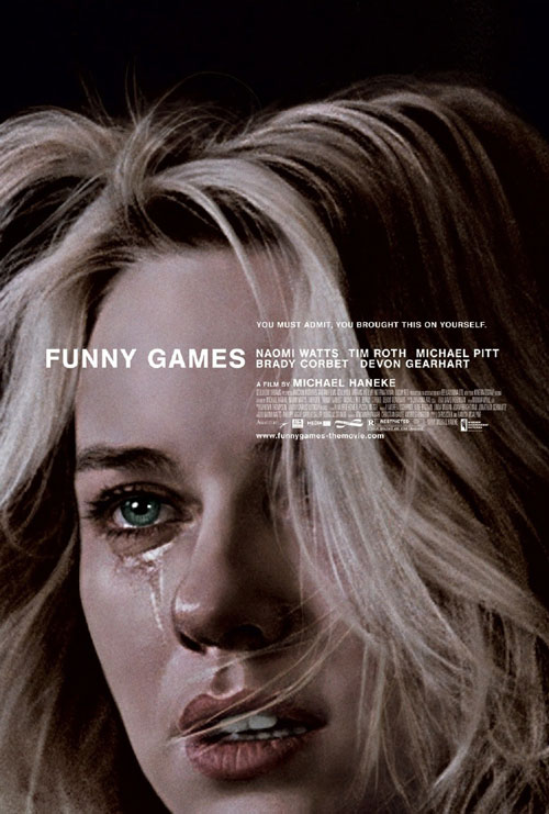
1. FUNNY GAMES (2007)
I realize that it is ironic that this is my pick for the best movie poster of the decade since we all know that the enemy of good movie poster design is the big celebrity close-up or the floating head. The Funny Games poster is after all nothing more than a giant close-up of Naomi Watts. But this poster both subverts and transcends that convention. I've never actually been sure whether this is a photograph or a Chuck Close-like Photorealist painting. If it is a painting then it is an exact rendition of a frame of the film, though rendered monochrome and with the background blacked out. That frame is a moment of abject terror and misery for Watts' character in the film, and yet the image on the poster, while vibrant with emotion, is also beautiful and eerily calm (and reminiscent of course of Anna Karina watching Falconetti in Vivre Sa Vie). Add to that the perfectly restrained and impeccably placed Helvetica type, and that tagline practically begging the viewer not to watch the film (if you’ve seen the Austrian original you know exactly what you’re in for) and I would challenge you to find a more striking and more indelible movie poster these past ten years.

2. THE SAVAGES (2007)
There is not enough illustration in movie posters these days, which makes Chris Ware’s poster for The Savages all the more special. Once again every element of this poster is perfectly arranged (OK, maybe the credit block is a bit too dominant for my liking), and I could look at it for hours. Philip Seymour Hoffman was memorably illustrated by Daniel Clowes (Ghost World) in 1998 in the poster for Happiness and so I initially thought this was by Clowes, but it definitely has more of the geometric precision and interest in typography of Ware (Jimmy Corrigan, the Smartest Kid on Earth). See also the Motel poster among the runners-up for another great graphic-novel-style design.

3. THE 40 YEAR-OLD VIRGIN (2005)
The face that launched a couple of careers, and a whole slew of copy-cat movie posters: the Sears photo portrait genre. As eerily unsettling in its way as the Funny Games poster.

4. I AM TRYING TO BREAK YOUR HEART (2002)
There is nothing I like more in a movie poster than white space. Most posters (think Harry Potter posters for example) fill every inch with detail and color. (At the other extreme there is what I like to call the Nancy Myers poster: where there is a photo of the stars in a neat band and some tasteful serif typography on a white background, but that is not the kind of white space I like). The poster for Sam Jones’ Wilco documentary is the acme of simplicity: a great black and white photograph (that tips you off to the dynamics of Jeff Tweedy’s band), acres of sky, and one of my favorite title treatments of the decade with that unconventional “a film about...” and the filmmaker’s name in the same size type...and that splash of color.

5. CLEAN(2004)
More white space. Much more. Maggie Cheung could make any movie poster look good, but this is in a class of its own. I love the credit block at the top of the poster—something designers have been experimenting with more and more (see also Funny Games), the title (more Helvetica) subtly eroding, and then that lovely high-contrast portrait.

6. ANYTHING ELSE (2003)
A poster I only discovered recently: the Japanese design for Woody Allen’s Anything Else. The American poster, with a grinning Jason Biggs carrying a giant heart-shaped portrait of Christina Ricci is about as bad as Hollywood comedy posters get, and I had little time for the film itself. But the Japanese poster, with its Pink Panther-esque cartoon over an antique map of Manhattan, is a keeper.

7. THE GIRLFRIEND EXPERIENCE (2009)
Designed by Neil Kellerhouse, this is the best poster of 2009. I wrote about it here back in April and it still looks good eight months later.

8. MORVERN CALLAR (2002)
The original British poster for Lynne Ramsay’s wonderful Morvern Callar. As with The Girlfriend Experience this abstracts its lead actress’s face almost beyond recognition. The (road)trippy image of Samantha Morton was adopted for the US one-sheet but didn’t work quite as well in the vertical space as it does here. There are a number of other British quad posters that almost made the grade and almost all of them (but not this one) were designed by my favorite UK poster designers All City (see Reprise, Old Joy, Crimson Gold and I Don't Want to Sleep Alone in the runners-up below).

9. PALINDROMES (2004)
Again, I'm a sucker for good illustration in movie posters (see also Dear Zachary in the runners-up). I don't know who the artist is (if anyone does please tell me) but I love their fairy-tale take on Todd Solondz’ eccentric road movie. And the ornate title treatment really makes it. Which leads us to last, and in so many ways least...

10. THE DEATH OF MR. LAZARESCU (2005)
The original Romanian poster for The Death of Mr. Lazarescu is the most inappropriate movie poster of the decade and hence one of my favorites. This is not simply a bad poster (in the way that, say, the poster for the new De Niro movie Everybody’s Fine is bad), but it is a verywrong poster. Anyone who has seen Mr. Lazarescu, which is one of the great films of the decade, will know just quite how wrong this is: a Carry On poster (or should I say National Lampoon) for one of the grimmest indictments of a society that the decade has seen. In the film the dying Lazarescu is shuttled through hospital wards and treated with either scorn or indifference, not cheek-tweaking bonhomie. I have circulated the poster a lot over the past few years and I have grown to love its willful wrong-headedness. In the US the film was promoted with a picture of a stark empty hospital gurney, a couple of house cats and a lot of accolades, which does make you wonder how differently this film was seen in Romania.
Finally, here are 20 runners-up that have caught my eye over the past ten years, in no particular order other than an aesthetic one:


