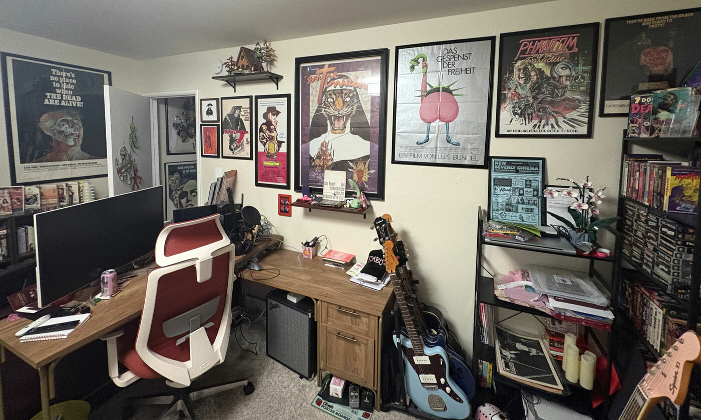
Drusilla Adeline’s poster-filled office.
In the nearly two decades that I’ve been writing Movie Poster of the Week, it’s been my greatest pleasure to get to know working graphic designers and illustrators from all over the world. Some I’ve interviewed for this column and some I’ve met in person and am honored to call friends. And though I’ve asked a number of them over the years to select their ten favorite movie posters of all time, there have always been other burning questions I’ve been dying to ask. Therefore I’m inaugurating a new occasional series where I ask seven contemporary movie poster designers seven simple questions about their work, their influences, and the state of the movie poster industry today.
The first seven, who’ve been tremendously gracious in answering my questions, hail from LA to Athens, Buenos Aires to Tennessee, and from Cardiff to Croatia. Some have been working as movie poster designers for just five years, some for more than twenty.
The first magnificent seven are, in alphabetical order, LA-based Drusilla Adeline (aka Sister Hyde), a self-described “midwestern trans punk” who has had a remarkable year designing nothing less than the key art for the blockbuster revival of Ken Russell’s The Devils (1971), and the Stanley Kubrick box set for Criterion; Argentinian designer Marcelo Granero, whose work I first got to know through his brilliant poster for the experimental film There Are Not Thirty-Six Ways of Showing a Man Getting on a Horse (2020); Athens-based superstar Vasilis Marmatakis, best known for his eccentric posters for Yorgos Lanthimos (he did 2015’s The Lobster, say less); Welsh graphic designer Beth Morris (aka BAMCreate), who has been a professional designer for five years and whose other life as a collage artist infuses her exquisite poster work; Tennessee and New York-based Sam Smith, a professional musician whose iconic orange kitty-from-hell design for Nobuhiko Obayashi’s House (1977) put him on the movie poster map in 2009, and who has been making some of the most beautiful arthouse posters ever since; meme-queen Akiko Stehrenberger, whose Funny Games (2007) poster I declared the best of the 2000s before I even knew who she was, and who has since become one of the living legends of her field, winning 34 Clio awards, and publishing a best-selling monograph; and Croatian designer Neven Udovičić, who recently went freelance and who, along with the very talented illustrator Sara Kern Gaćeša, has been producing beautiful work for the ICA in London among others.
And now for the questions:
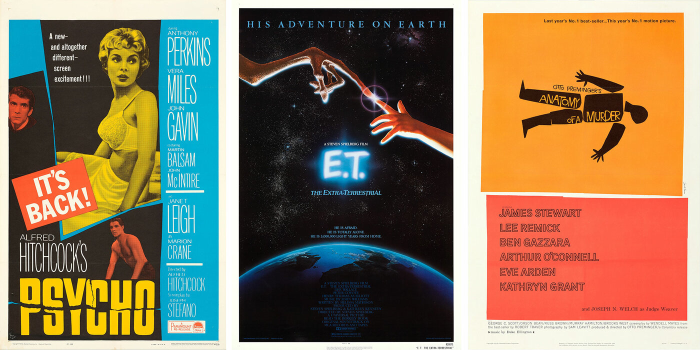
Posters for Alfred Hitchcock’s Psycho, Steven Spielberg’s E.T. and Otto Preminger’s Anatomy of a Murder.
1. Was there one movie poster that sparked your desire to design posters?
DRUSILLA ADELINE: The poster that made me fall in love with movie posters as an art form, but also gave me the inspiration to see them as something attainable that I could create myself, was René Ferracci’s art for Luis Buñuel’s The Phantom of Liberty (1974). It’s a bit of a companion poster to the one he did for Buñuel’s Discreet Charm of the Bourgeoisie (1972), and features a witty collage riffing on the statue of liberty, some fowl legs, and a rather crude piece of anatomy that really stuck in my adolescent mind. It had a very handmade, Gilliam/Python feel to it that felt accessible, while also feeling exceptionally thoughtful and clean in a way that immediately presented it as being artful. Having never had much of an aptitude for traditional illustration, it made both visual art in general and film posters specifically seem like something that I could aspire to.
MARCELO GRANERO: I don’t think there was just one in particular—there were several. My interest in cinema was mostly shaped by video stores, back in the pre-internet days. I often had no idea what a movie was about, so it was the posters or VHS cover art that first caught my eye. I’ve always paid a lot of attention to that. Of course, most of those posters had a more commercial approach. It wasn’t until I was studying graphic design in college that I discovered Saul Bass’s work. It completely opened my mind to the idea that movie posters could be something entirely different. His designs for The Man with the Golden Arm (1955) and Anatomy of a Murder (1959) especially blew my mind. They had this rhythm and simplicity that I found incredible. Basically, works of art.
VASILIS MARMATAKIS: I still remember as a child getting lost in the E.T. the Extra Terrestrial (1982) poster. It was the combination of the image with the text: I was trying to understand what “3,000,000 light years from home” meant and if that was the light that was illuminating their hands.
BETH MORRIS: It would have to be the Psycho (1960) poster with the Tony Palladino lettering. For my final GCSE Graphic Design project, I designed a fake noir/thriller film poster heavily inspired by the design (and I also strangely made up a Peeping Tom-esque story before learning about the film!). The torn and ripped collage elements have clearly been a huge influence on my work and when I went on to study fine art in uni my work was almost completely collage based and based around film stills.
SAM SMITH: As an adult seriously considering the idea, it wasn’t one poster but a book of Cuban posters in total. Going back to being a kid, though, the obsession started with studying and re-drawing the one-sheets for Teenage Mutant Ninja Turtles and the teaser poster for Dick Tracy (1990). The one from that era that probably started it all was Batman (1989).
AKIKO STEHRENBERGER: I never actually set out to design movie posters, as illustration was my main focus. However, some of my earliest memories of admiring them as a child were the illustrated James Bond posters from the Sean Connery and Roger Moore eras. My dad had a book of 007 posters that I loved looking through.
NEVEN UDOVIČIĆ: It’s hard to pinpoint just one poster, but I can easily name the Anatomy of a Murder by Saul Bass as a major influence. I was obsessed with his work during my college years, being much more drawn to his simple, graphic style than to illustrative approaches such as Drew Struzan’s. His designs showed just how much you could communicate with simple shapes and a strong idea.
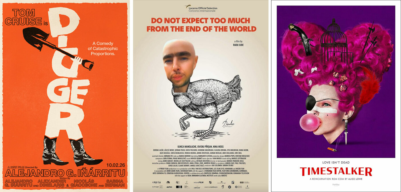
Posters for Digger, Do Not Expect Too Much from the End of the World and Timestalker.
2. What’s a recent poster you saw that made you want to see the film? (And did you end up seeing it?)
ADELINE: There have been so many amazing posters of late; people that say the art of movie posters died at the introduction of Photoshop are truly not looking around them. I adore the recent posters for Digger (2026), I Love Boosters (2026), The Bride (2026), Eddington (2025), Universal Language (2025), and Kinds of Kindness (2024). But those were all movies I would have seen anyway. The poster that caught my eye out of nowhere and captured my imagination so much that I sought the film out for months, waiting without knowing almost anything about it, was for Alice Lowe’s Timestalker (2024). The early UK poster features Lowe’s disembodied head blowing a piece of bubblegum, decked out in Adam Ant-esque New Romantic makeup, an eye patch, and adorned with a heart-shaped, electric-pink wig appointed with ribbons and weapons. Is that not everything you could want out of a movie?? It immediately sold me, and told me what I could expect. And nearly a year later, when it finally got a quiet US VOD release, I watched it as soon as I could and it fully lived up to the dreams and images that poster conjured in my mind. Shamefully, I don’t know who designed that poster. I’d like to take them out for a pint.
GRANERO: I’m pretty familiar with Hong Sang-soo’s work, but I just had to find out if By the Stream (2024) was as incredible as its poster, designed by Brian Hung, suggested. Luckily, the film was just as good.
MARMATAKIS: The Dodo poster for the Romanian Radu Jude’s 2023 film Do Not Expect Too Much From the End of the World. Great film.
MORRIS: The Marketa Lazarova (1967) poster by Zdeněk Ziegler. I saw it shared online and it happened to be screening at the Garden Cinema in London when I was there a couple of months ago and it was incredible. Some of the La Bola Negra posters have been really beautiful too, with the mixture of photographic and painterly/hand-drawn elements.
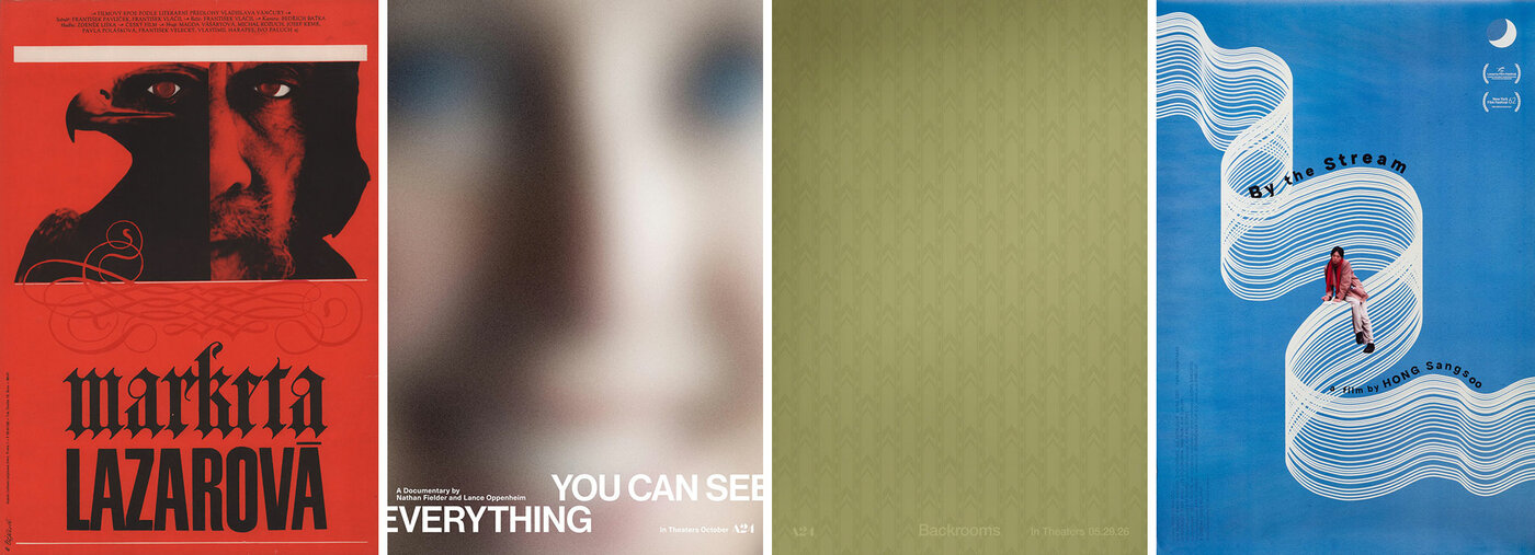
Posters for Marketa Lazarova, You Can See Everything, Backrooms and By the Stream.
SMITH: I already wanted to see this anyways, so yes, I did, but the teaser poster for You Can See Everything. Continuing with the final one-sheet and the subway posters and billboards, it’s the campaign (and film) of the year for me.
STEHRENBERGER: Backrooms. Just the wallpaper… fuckin’ brilliant! I don’t know how the hell they got this through but [creative agency] AV Squad gets big applause from me for this. Yes, I saw the film too!
UDOVIČIĆ: Definitely Digger (which is also a lovely revival of the Saul Bass style). I came across the poster on Instagram a while ago and decided not to watch any teasers or trailers, just to keep myself completely in the dark. The design promised something special, but so did the names “Iñárritu” and “Cruise.” I ended up seeing the film twice and it more than met my expectations.
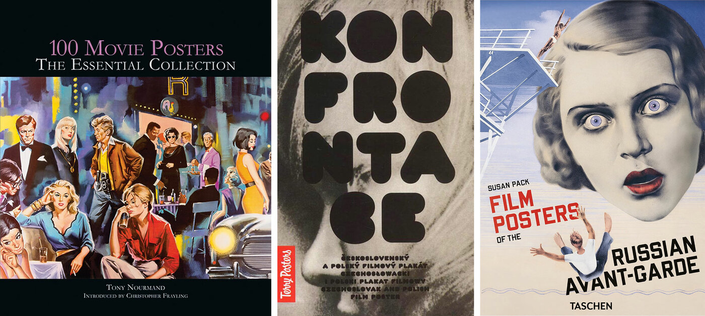
Book covers for 100 Movie Posters: The Essential Collection, Confrontation and Film Posters of the Russian Avant-Garde.
3. What’s your favorite book about movie posters?
ADELINE: As mentioned previously, my favorite poster designer is René Ferracci. His original French campaigns for the films of Luis Buñuel, Fassbinder, Ken Russell, Henri-Georges Clouzot, Fellini, Costa-Gavras, Jacques Tati, François Truffaut, mixed with his irreverent work for French comedies (and one exceptionally zany piece for the Peter Falk classic The In-Laws (1979, retitled for the French market as Don’t Shoot the Dentist)). culminate in a career full of surprises and variety, all tied together by consistent beauty and an iconic singularity. I don’t think anyone was better at distilling a film down to a single image. My prized possession is a book titled Ferraci: Affichiste de Cinema, which is entirely in French (and appears to be out of print). It was recommended to me by the great designer, and ultimate librarian of design books, Brandon Schaefer. It might cost a pretty penny, and really test how much you remember your tenth grade French classes, but it’s truly invaluable to have all of Ferracci’s work in one place, and to see sketches and unfinished work. The cherry on top? The book culminates in a full process breakdown behind the designing of the Phantom of Liberty poster, including a glut of unused, equally leftfield material.
GRANERO: I recently got a book about Soviet film posters called Film Posters of the Russian Avant-Garde, by Susan Pack, published by Taschen. I’m fascinated by the compositions, the use of typography, and those incredibly dynamic layouts. The Stenberg brothers are definitely my favorites.
MARMATAKIS: Currently The Basement Tapes published by V.S. Press. It’s a collection of front and back VHS tapes covers of mostly obscure straight-to-video films. Quite wild themes and artworks.
MORRIS: The one I always go back to is the Klimowski Poster Book: that and the huge Art of the Polish Poster book. It features such wide-ranging styles, and it’s always helpful to look through it and see what jumps out depending on the project.
SMITH: Confrontation, released by Terry Posters, is a favorite. It pits side-by-side large, colorful reproductions of Polish and Czechoslovak posters for known films. Each spread presents an interesting contrast in wild, bold approaches to a given film subject, and is just extremely visually inspiring.
STEHRENBERGER: Most of my art books are not movie related, but two in my bookshelf right now are from Poster Spy: Rafa Orrico: Alternative Posters and Aleksander Walijewski: Alternative Posters.
UDOVIČIĆ: I’m always on the lookout for new books about movie posters, as I can never have enough of them, but a favourite from my collection is Tony Nourmand’s 100 Movie Posters: The Essential Collection. It was a present from Sara (who is both my wife and design collaborator), although technically, she never actually gave it to me. While we were still dating, I found the book “hiding” on her bookshelf. She had bought it for me as a present but was afraid to give it to me, thinking I already had so many cool books that I might find this one a bit lame. But it’s a wonderful selection of posters, accompanied by comments from the author.
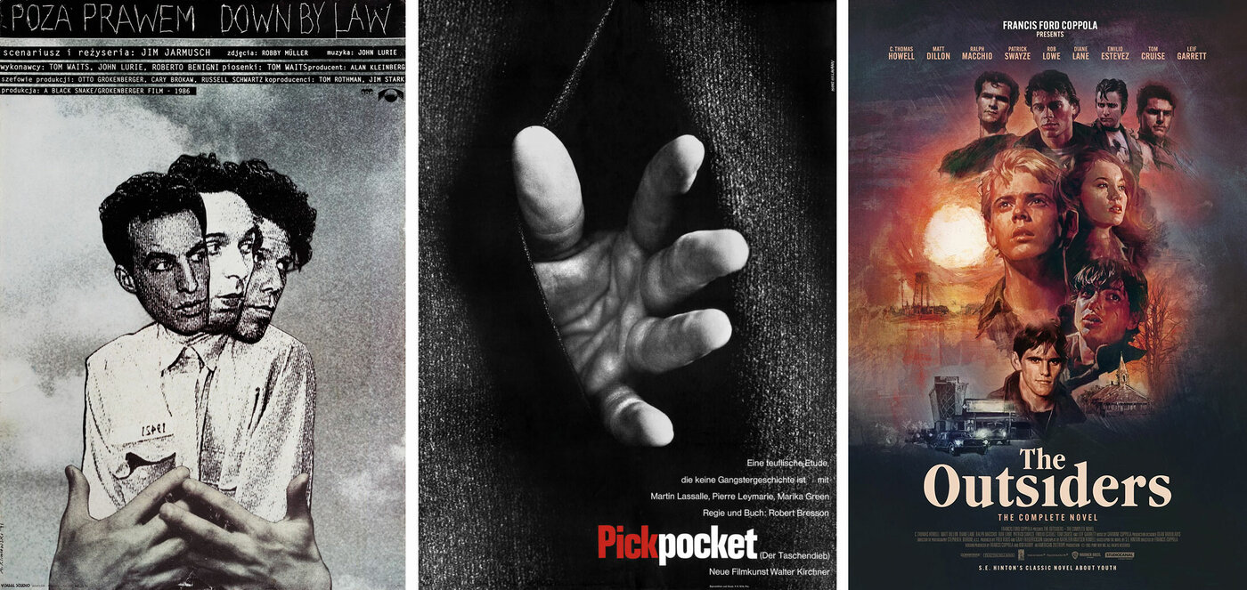
Posters by Andrzej Klimowski, Hans Hillmann and Tony Stella.
4. If you could spend a few hours in the company of any poster designer (living or dead), watching them work, who would it be?
ADELINE: Saul Bass is the legend, a very easy answer. Ferracci is my hero, but I’ve beat the drum for him enough, I don’t want to get repetitive. Watching Frank McCarthy paint muscular renderings of James Coburn running from an explosion on a ’70s action poster would be a dream come true. I would love to chat with Iván Zulueta about Buñuel and Almodóvar (and try to convince him to kick the heroin habit…).
But I think the only answer, and most personally rewarding experience, would be to spend an afternoon watching Tony Stella paint. Tony’s talent and output always felt supernatural, and it still doesn’t feel real that he’s no longer with us. The prospect of living in a world without a new Tony Stella painting is both so hard to grasp and reveals just how much we took his near daily output for granted. As far as I can tell, few people had the experience of watching Tony work. Or even saw Tony’s face, it seems. I just simply wish I could see those supernatural gifts in person.
GRANERO: So many come to mind! Let’s pick one from each era, just for fun. The first one I think of is Saul Bass. I’d love to watch him develop and conceptualize ideas. For something more contemporary, I’d choose the work of V Industries (aka Caspar Newbolt). I absolutely love how they mix analog and digital styles. Their work always has this mysterious mood and such a unique visual identity.
MARMATAKIS: Andy Warhol in the first (silver) Factory in the ’60s.
MORRIS: Probably Andrzej Klimowski, I just love his mixture of illustration and photographic elements and would love to see how a design comes together!
SMITH: I always ask myself, “What would Hillmann do?” so I’d have to say Hans Hillmann, so that I could actually see him doing what he would do! He used so many techniques, from photomontage to drawing at both small and large scales—it would be great to shadow him around his studio and get a masterclass in visual experimentation, with maybe a choice German Pilsner afterwards.
STEHRENBERGER: Tony Stella. I would have loved to watch him paint and witness his collaborative design process with Midnight Marauder on their Alphaville projects.
UDOVIČIĆ: I would have loved to spend some time with Boris Bućan, one of Croatia’s greatest artists and designers. He is best known for his large-scale, square-format posters, and looking at his work feels like tapping into an endless source of inspiration. His style evolved over the decades, as he never liked to repeat himself. Watching him work would have been a real treat.
5. What is your biggest graphic design pet peeve?
ADELINE: Typography. The first thing my eye goes to, and invariably I’m more frequently disappointed than not. Uninspired or inappropriate font choices, inconsistent kerning, lack of hierarchy or use of scale. It’s the kind of thing, once you start to work on it on a daily basis, you can’t unsee it everywhere in the world. Type is one of the most important and versatile tools in your belt, and it disappoints me how often it seems to go unconsidered.
GRANERO: I get annoyed when aesthetic references are used just for the sake of it, without any real thought or concept behind them. Sometimes it feels like the only goal is to make something look nice or visually striking. To me, that’s the most boring kind of design: design with no soul. I think looking at references is great. They help you discover new visual languages and understand different styles, but at some point you have to make them your own and find your own voice. I feel like the growing use of AI is often pushing things in the opposite direction, towards generic, uninspiring designs that don’t really bring anything new to the table. I love when a design feels tangible, when you can see the textures, the imperfections, the human touch, even when the process is purely digital.
MARMATAKIS: The current use of the word “aesthetic” to describe a style.
MORRIS: I work on a lot of collage-based designs, but love negative space too. So I’d say anything that feels overly cluttered, unless it’s intentional! It’s nice having breathing space in a design.
SMITH: I’ve always disliked fake textures. I’ve added my share of grunge and speckle layers to my files, don’t get me wrong. And overtly retro, referential designs have their place and time, given the appropriate brief. But I like the idea that actual, physical posters will get their own fold lines, tears, and aged wear over time; no need to simulate them. Another recent pet peeve (I have so many!)—and this is more a systemic side-note—and that’s the removal of billing and other type from thumbnails online, an issue stemming from how The Movie Database ports its images into sites like Letterboxd. Type, billing, logos… they’re all part of the elegance of poster design. The streaming business has mangled the movie poster nearly to death at this point, and yet it somehow survives…
STEHRENBERGER: My personal pet peeve is when someone revises my work after I’ve turned it in, whether it’s changing my typography or altering the contrast of my illustrations. I’ve spent endless hours on it… just ask me to do it, please! My professional pet peeve is studios using AI and trying to pass it off as original illustration. A big giveaway is no artist credit, awkward compositions and anatomy, and an unnatural level of detail throughout the entire image.
UDOVIČIĆ: I would usually mention something like bad kerning or cheap-looking handwritten typefaces (both great ways to ruin what could otherwise be good design), but these days nothing pisses me off more than AI. It’s bad in so many ways. I’m very forgiving when it comes to design “mistakes,” as we’re all learning things every day, but I find it hard to see any justification for generating a piece of design with AI.
6. If there was one thing you could change about the movie poster business, what would it be?
ADELINE: It’s one of the few creative fields within the entertainment industry that doesn’t have a union, which feels like an obvious fix. I would also banish any form of AI as far as possible from the creative process. It saddens me greatly how often I see it being used in ideation and concepting, and even designers trying to hide their use of it in final works from clients. You can do so much smarter, thoughtful work with a pen and piece of paper and your own interpretation of a film or creative brief than a string of code (eroding the planet) ever can.
GRANERO: I feel like design is often the last thing on the production schedule, which usually means tight deadlines and smaller budgets. I think things are slowly starting to change, though. There are directors who understand the importance of design and how a movie poster can sometimes become part of the conversation around a film.
MARMATAKIS: The insanely restricted horizontal super-long streaming platform formats.
MORRIS: More time on projects; having a slightly longer deadline means you have more time for play and experimentation. I like to sit with the film and let it run around in my mind for a while before jumping into ideas.
SMITH: I would say there’s a dire need for more general trust. Trust towards poster designers, sure, to create cool things. But what I really mean is trust towards the general audience. The more capital at stake, the less risk clients will take, but we need to dismantle this very outdated definition of risk. We are so far and well beyond the point of the floating head/pyramid/Marvel poster build having any impact or meaning to a potential viewer—any average person off the street would make fun of those posters. And yet they still proliferate for what’s been running on two decades now. This is just one example of the safe, supposedly data-backed conservative choices that companies fall back on, during admittedly a scary and transitional era for the movie business, but an era that is also exciting and primed for possibility and creativity. All people want is to be caught off-guard by something striking or beautiful that catches their eye. The posters that succeed there are the most memorable and beloved, pushing the medium forward, and the powers that back these choices will be rewarded.
STEHRENBERGER: Clients using AI to generate their ideas in an attempt to “save time” or “fast-track approvals.” Not only does it rarely speed things up, but it also creates unrealistic expectations around execution and turnaround times. I take a lot of pride in my concepts and art direction. Because I’m versatile, I’m extremely intentional about choosing an illustration style that best serves each idea. Skipping those two crucial stages often results in generic, middle-of-the-road work.
UDOVIČIĆ: If I had a magic wand, I would bring movie posters back to the streets. Great posters are still being made (I know because I follow a bunch of awesome designers, so my Instagram feed is full of them), but they’ve largely disappeared from our shared visual culture. We spend so much time in algorithm-driven bubbles, and most people don’t encounter movie posters in their everyday lives. If they do, it’s usually as a thumbnail on a streaming platform. On the street, however, a poster can reach anyone. They might stop and look, wonder how it was made, or what it means. These encounters, especially for children, can spark curiosity and help develop an eye for visual communication. So instead of just being about film promotion, they could make a meaningful contribution to visual literacy.
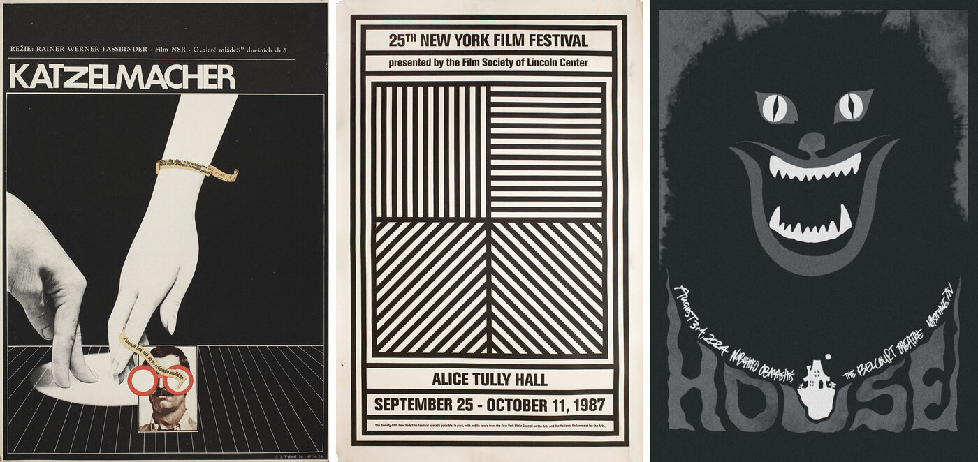
Posters for R. W Fasbinder’s Katzelmacher, the 1987 New York Film Festival and Sam Smith's variant poster for Nobuhiko Obayashi’s House.
7. As you’re answering this survey, what movie poster (if any) do you have framed or pinned on your wall closest to you?
ADELINE: I’m answering this in my home office, and the walls are currently adorned with posters for The Phantom of Liberty (Ferracci), Dark Habits (1983, designed by Zulueta), Justin Osbourn’s poster for Phantom of the Paradise (1974), Return of the Living Dead (1985), Family Plot (1976), The Dead Are Alive (1972), The Milky Way (1969, designed by Ferracci), The Evil Eye (1963), Lisztomania (1975), a Hans Hillmann booklet for The Criminal Life of Archibaldo de la Cruz (1955), and, of course, Dr. Jekyll & Sister Hyde (1971).
GRANERO: The closest one is a postcard-sized version of the Czech poster for Fassbinder’s Katzelmacher (1969), designed by Josef Vyleťal. A beauty, of course!
MARMATAKIS: A The Head on the Door promo poster from The Cure, designed by Parched Art.
MORRIS: In my office, above a bureau, I have one of Sam Smith’s House variants, a Jennifer Dionisio drawing and a Japanese poster of The Favourite (2018) on the wall.
SMITH: The 1987 New York Film Festival poster designed by Sol LeWitt. It’s a subway poster that I got at Posteritati, and it’s a purely abstract geometrical design. My dream is to design a NYFF poster, and I’d love to go back to some of these classic approaches.
STEHRENBERGER: I actually don’t have any movie posters hanging up. My career already consumes enough of my life! Both my office and home are filled with art that inspires me and reminds me to step away from the computer to make things with my hands.
UDOVIČIĆ: Not technically a movie poster, but right next to me, almost touching my shoulder, is a poster for Il Cinema Ritrovato, a very special film festival in Bologna that Sara and I visit whenever we can. It features Marcello Mastroianni and Sophia Loren in a scene from Lucky to Be a Woman (1956). The other one, a proper movie poster, is for Anton Corbijn’s Control (2007), which I got from a local cinema when the film was playing. It reminds me how quickly time flies (I still somehow think of it as a fairly recent film).
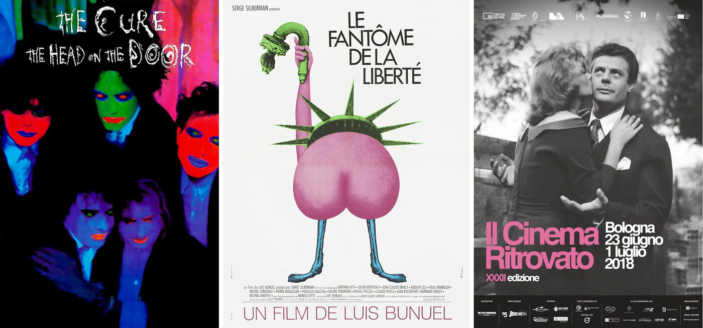
Posters for The Cure, Luis Buñuel’s The Phantom of Liberty, and the 2018 Il Cinema Ritrovato festival.
Many thanks to Drusilla, Marcelo, Vasilis, Beth, Sam, Akiko and Neven. Watch this space for 7 questions for 7 more designers in the future.