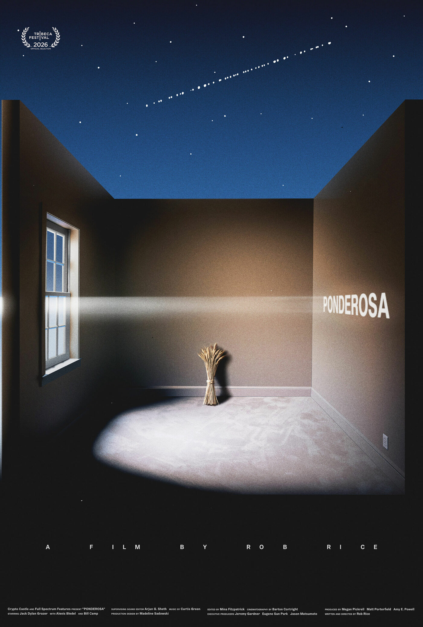
Above: US one sheet designed by Caspar Newbolt for Ponderosa (Rob Rice, USA, 2026).
Ever since I interviewed designer Caspar Newbolt about his poster for The Act of Coming Out (Alexandra Stergiou, 2022) and he spoke so eloquently about the art of making posters, I’ve been wanting to ask him about his favorite movie posters and the designers who inspired him. With the opportunity to spotlight his newest poster, for the indie film Ponderosa (2026), this seemed the perfect time. Premiering at the upcoming Tribeca Film Festival on June 6, and billed as an experimental comic horror movie, Ponderosa is directed by Rob Rice and concerns a young man named Zeke who, “when the buffet where his mom works closes down, is forced to entertain the wild advances of a rich regular who is weirdly and vehemently obsessed with becoming his father.” Newbolt designed the poster for Rice’s first feature, Way Out Ahead of Us (2022) and his design for Ponderosa is as oblique, intriguing, and flat out beautiful as all of his best work.
You can see where Newbolt is coming from, and what he values most in graphic design, by looking at his favorite posters and reading what he thinks about them.
CASPAR NEWBOLT’S TOP TEN FAVORITE MOVIE POSTERS
Like a lot of us doing this, I stumbled and fell backwards into making film posters. In 2011 I was working mostly as a website designer, bumming around New York trying to make sites for rock bands and real estate brokers. In the spring of that year a friend asked me to lecture a room of filmmakers in Manhattan about making websites for films. The talk was hosted by Jon Reiss, who I found out soon after had directed the seminal Nine Inch Nails music videos for “Happiness In Slavery” and “Gave Up,” and who would later invite me to work with J. J. Abrams on an alternative reality game in Los Angeles. Jon and I remain friends, and meeting him alone would have been enough to change my life. However in the shadows of that dark lecture hall also sat—amongst others—Tim Sutton, a filmmaker with whom I’ve now made posters and titles for seven feature films.
Creatively speaking, I always say “yes” to doing something I’ve never done before and then go home in a panic and quickly figure out how to do that thing. I never went to art school or design school, so this is a good way for me to catch up on some of the schooling I never had. Tim asked me if I could make a poster and titles for his debut feature Pavilion (2012) and I said, “Of course!” This wouldn’t be the last time Tim saw in me something that I did not.
I try very hard to not look at film posters when I work and to do everything in my power to draw from other sources for ideas. I do this because I believe that a really good film poster should be more than just promotional artwork for a film, and in so doing it should not think like other film posters. A great poster should be a piece of artwork that you want on the wall because it—like the film it was based upon—has the poetic capacity to speak to you about your own life. After all, film posters, like all visual marketing pieces, get put up around town without anyone’s permission. Thus, as the Polish poster-maker Leszek Żebrowski suggested when he said to me, “I like making posters because it means I don’t have to get into art galleries any more—the streets are my art gallery now,” it rests upon the shoulders of any poster-maker to make sure our streets are as beautiful as we can make them.
To that end, the following 20 film posters are the exceptions to my own rule. These are the posters that, despite my searching for ideas elsewhere, continue to hugely influence my practice. Each of them has haunted me in different ways for years as I continue to try to make something beautiful and thought-provoking for those of us on the street, going about our daily grinds.
1. French grande by Raymond Savignac for Lancelot du Lac (Robert Bresson, France, 1974).
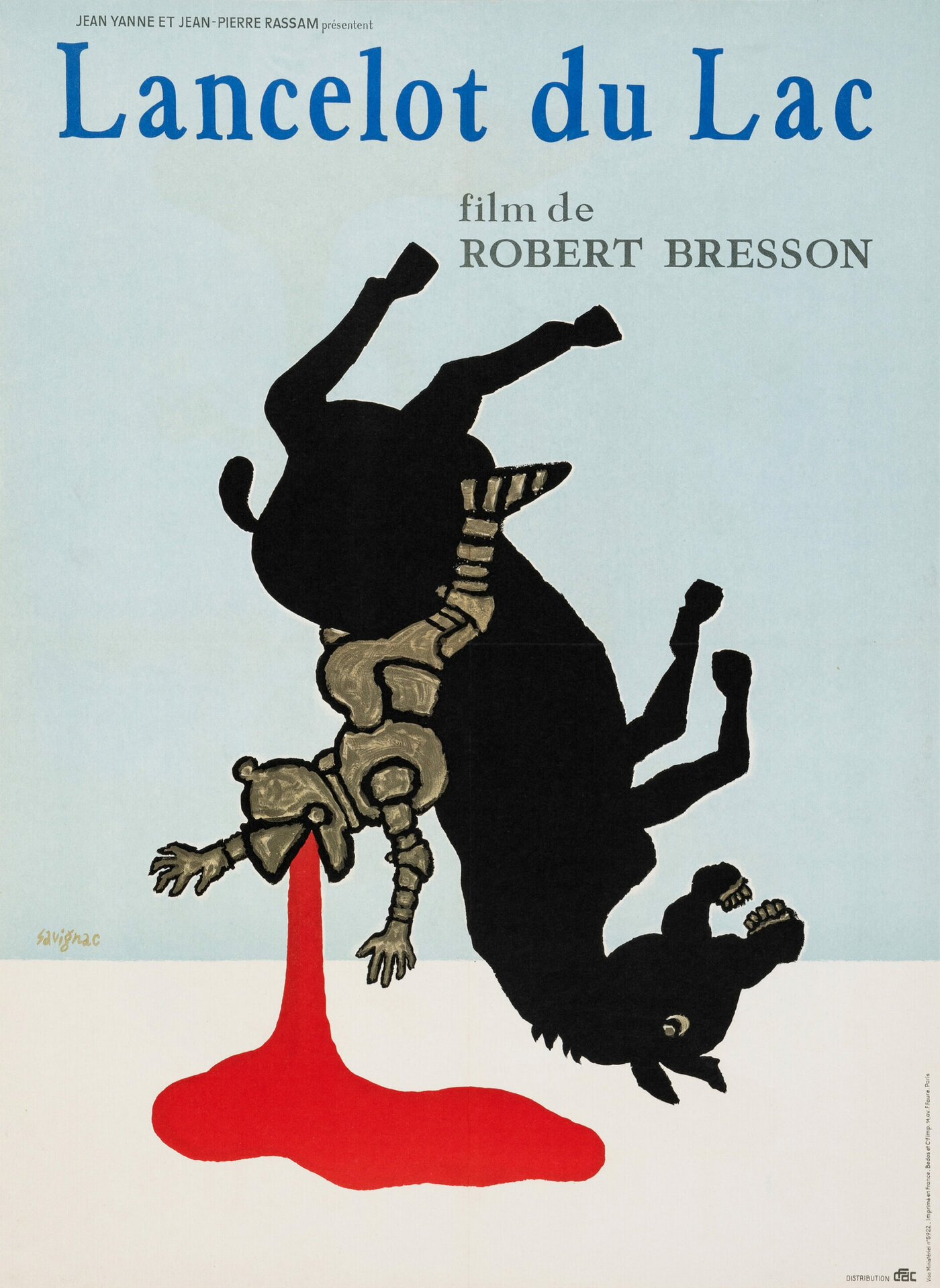
If I had to pick one, and I do now, I’d say that this is my favorite film poster. I have this one on my wall at home in Berlin, thanks to Posteritati. The copy I have is an original print. It’s 47 x 63 inches and printed using inks that haven’t faded at all from years of direct morning sunlight. While Lancelot du Lac is far from my favorite movie by Bresson, this is an image that tirelessly demands that I put more beauty, urgency and humor into my work.
If you look closely at the poster you can see Savignac’s original pencil lines before he applied the paint. Similarly the beautifully reproduced scratchy paint work on the knight’s armor has a quality that makes it feel—particularly at this scale—as if I had the original painting on my wall.
Above all though, this poster is brave. It’s a cartoon of an image being used to represent a live action feature film, and it speaks broadly to the humor and horror of the human condition. This is a critical point that I cannot stress enough, and it’s a lens through which all of the following posters, I think, offer their radically varying points of view.
2. 1972 Czech poster by Zdeněk Ziegler for Love in the Afternoon (Billy Wilder, USA, 1957).
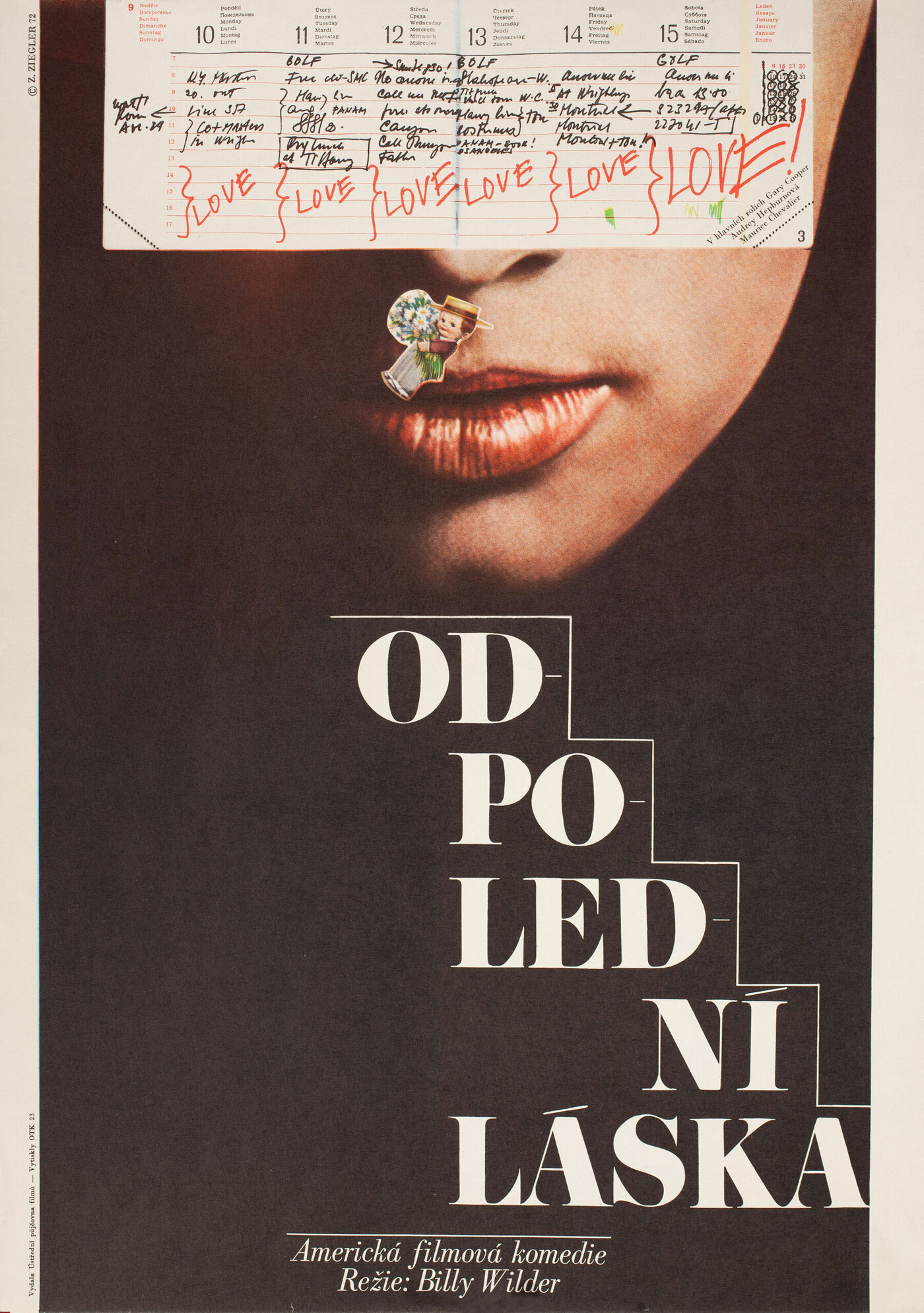
I’ve been glancing at a JPEG file of this Zdeněk Ziegler poster for over a decade now. However, it was only when sitting down to write this list that I translated and learned what film the poster was actually for. I’ve never even seen Billy Wilder’s Love in the Afternoon, but clearly I’ve kept this poster amongst my clippings regardless. Whether it’s the oddly placed little sticker, the diary entries, or the staircase leading up to her face that grab your attention, for a poster from 1972 this piece feels rather more modern, alive and experimental than most posters now.
3. 1975 Polish poster by Mieczysław Wasilewski for Pat Garrett and Billy the Kid (Sam Peckinpah, USA, 1973).
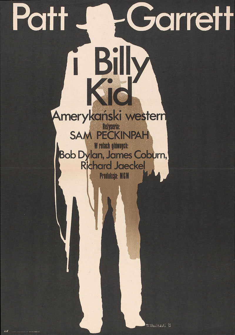
I have a theory about Vasilis Marmatakis’s excellent poster for Yorgos Lanthimos’s The Lobster (2015) and I guess now is the time to publish that theory, given that this Pat Garrett and Billy the Kid poster so substantiates it.
The theory is this: The Lobster poster isn’t just a great poster for the film The Lobster, it’s a great poster for every film. It’s, in fact, a universal film poster. Simply put, you could scratch out the title The Lobster from the poster and write almost any other film name there instead, and the poster would work beautifully. Often filmmakers I’m working with send me the film posters they like or that they hope might inspire our work together. The Lobster poster is regularly included. This is a fact that further supports this theory.
The poster above by Mieczysław Wasilewski proves itself time and again to also be one of these universal film posters. Simply adjust the cut-out figures to that of your film’s protagonists and you could have a poster for a film about someone retreating inside themselves, a poster for a film about someone coming of age, a poster for a film about someone going back in time, a poster for a film about succession, a poster for a film about unrequited love, a poster for a film about swapping bodies with someone else… Honestly, you name it…
Saul Bass was by his own admission someone who tirelessly searched for such universal devices, and to powerful effect. They’re certainly not the be-all and end-all in this kind of work, but if you stumble upon a new one you could have a piece of work that speaks to people more deeply than you originally intended.
4. US poster by by Arsen Roje, with creative direction by Philip Gipps, for Straw Dogs (Sam Peckinpah, USA, 1971).
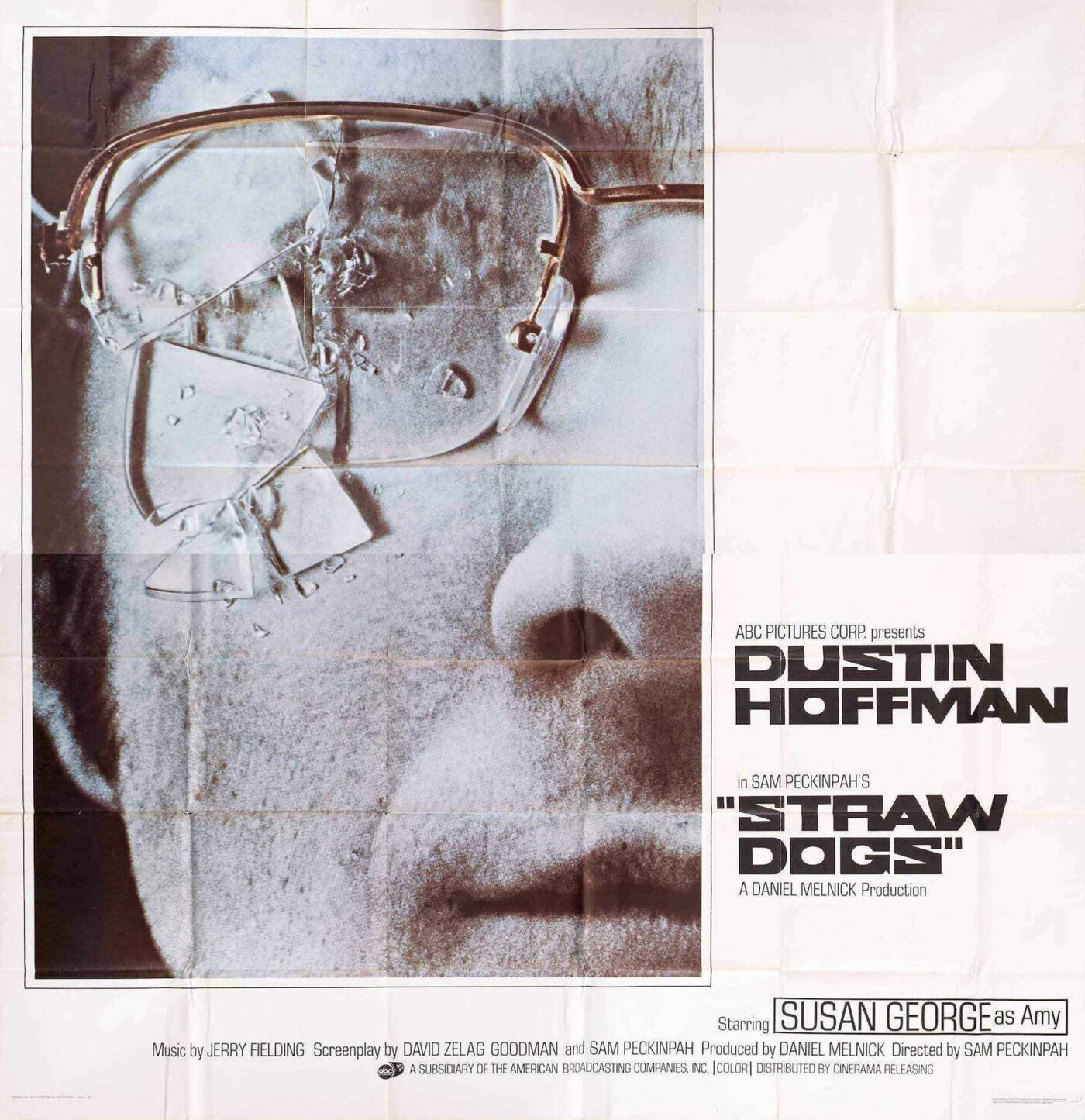
I was given a half-sheet version of this poster by my oldest New York friend, the musician and poet Zach Barocas. I had it on my wall in New York for years and I’ve still not found a way to ship it to Berlin. This is because someone glued it to a foam backing that means I’d have to carry it on an airplane with me to avoid damaging it.
Everyone knows this poster and as Zach rightly pointed out to me recently, it’s the poster that has perhaps had the most impact on my work. Make of that what you will, but it’s a strikingly original, brutal, and captivating poster treatment—an approach that underlines the validity of bringing handmade, analog elements into one’s poster-making practice.
5. Czech poster by Vladimír Tesař for Le joli mai (Chris Marker & Pierre Lhomme, 1963).
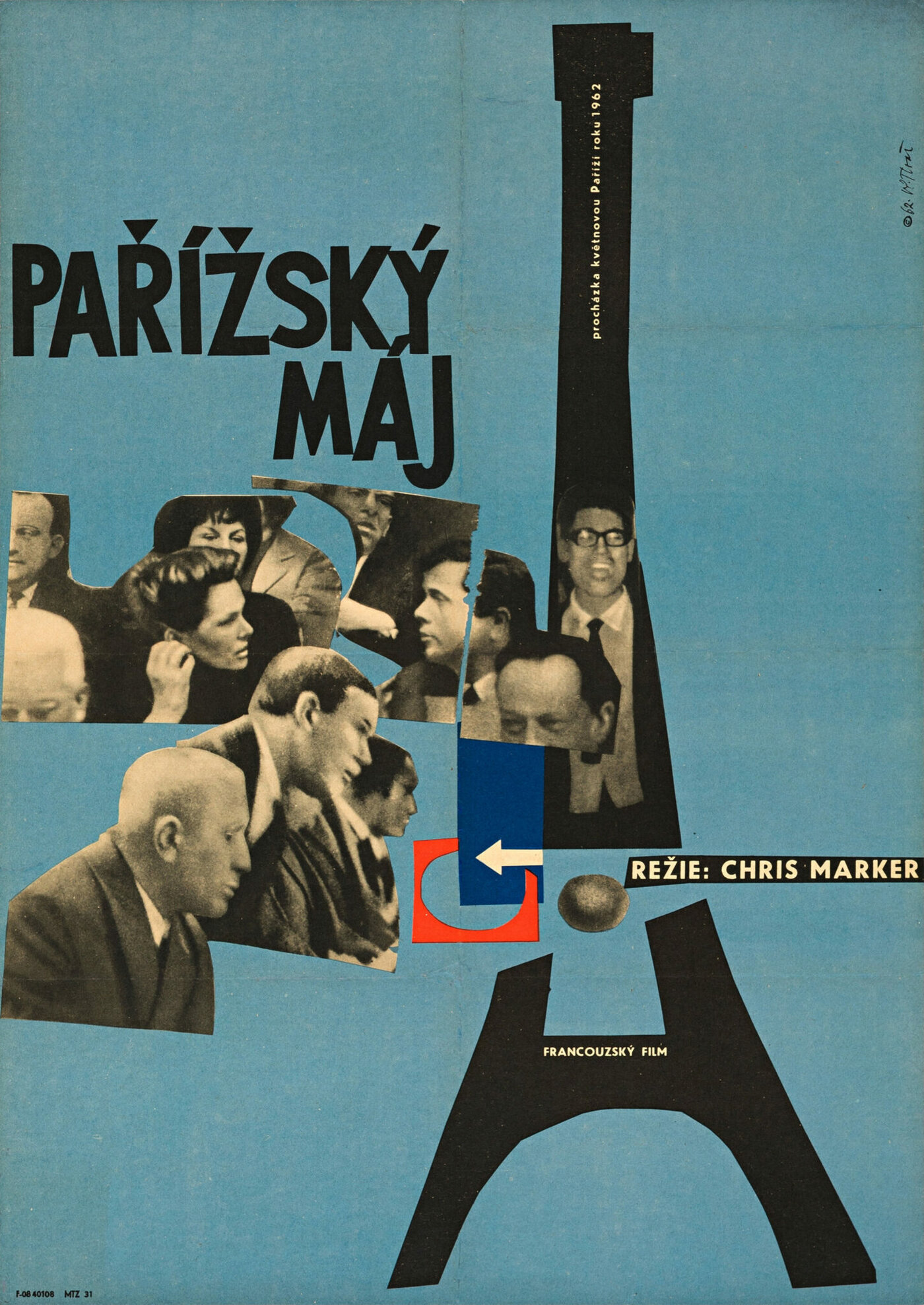
Often when I’m stuck on a poster and can’t figure out how to make it better, the poster above comes into my head and I try (albeit fruitlessly) to think of a way to make my work more like it. I’ve never seen Le joli mai by Chris Marker and Pierre Lhomme, but the pure joie de vivre that this work emanates is aspirational.
Critically, it’s the blue paper background, the Matisse-esque paper cuts, and the loosely placed newsprint photo fragments that bring this poster away from a crass marketing ideology, and into a place with a more artistic mindset, as Chris Marker’s work deserves.
6. US one-sheet by Saul Bass for The Magnificent Seven (John Sturges, USA, 1960).
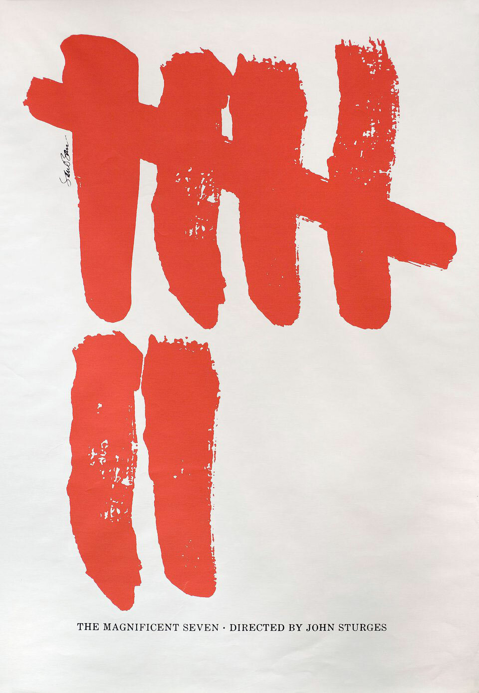
I shared a studio with the graphic designer Stefan Killen for almost ten years. He had a bookshelf with all sorts of amazing things on it, like old copies of Ray Gun magazine, novels by Jean-Paul Sartre, and a massive book of Saul Bass’s work. Needless to say, I went through that Bass book like a magpie in a jewelry store, and turning the page to this poster above heralded one of those great epiphanies: Can a film poster really be that simple and yet that clever? By god, the power I could wield were it true…
7. German poster by Hans Hillmann for Vivre sa vie (Jean-Luc Godard, France, 1962).
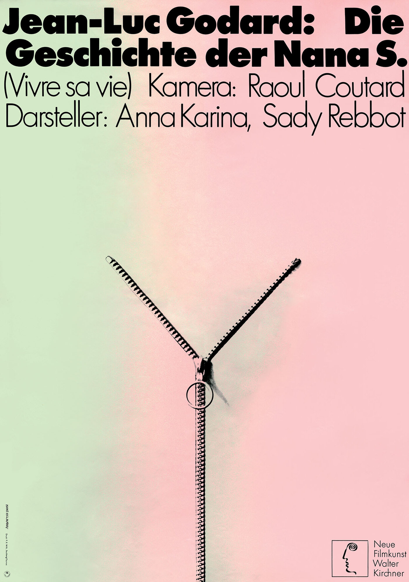
You could put 20 Hans Hillmann film posters in this list, nothing else, and it would still arguably be a list of the 20 best film posters of all time. He is, in my opinion, the greatest to ever do it. I believe his body of work is all you would need for a sound schooling as a graphic artist.
I have seen Jean-Luc Godard’s Vivre sa vie. It’s a film that shifted my point of view on filmmaking and life when I saw it in 2014, and to go with it is a poster that likely made many graphic designers' hearts leap.
Related note: Despite his obvious graphic design talents, Godard regularly had some of the worst posters made for his films upon their initial release in France. At that very same time in Germany, Hans Hillmann consistently made sure the German poster for Godard’s films was not just the best poster for that film, but singularly one of the best film posters ever made. Godard seemed to eventually twig to this fact and included two or three of Hillmann’s posters on the walls in his own films.
8. US one-sheet by Saul Bass for Exodus (Otto Preminger, USA, 1960).
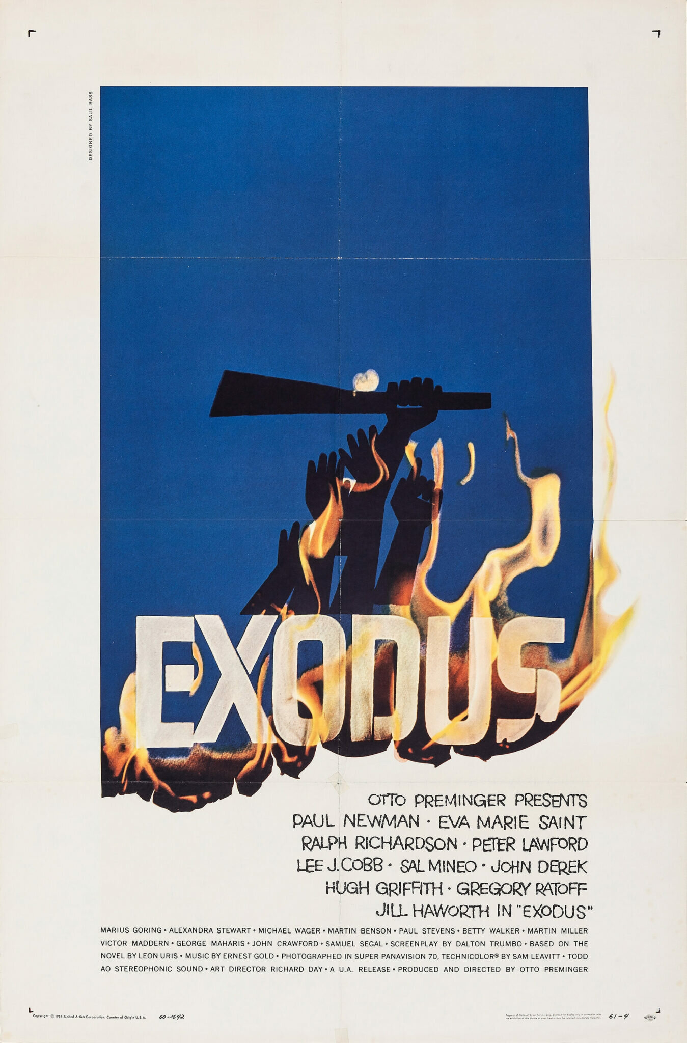
A thing I think about a lot in my practice—thanks in a large part to my years working on Filmmaker Magazine—is how to make print work that looks like it’s physically moving, or has just moved, without using ugly motion blurs or similar effects. Given the inherently static and flat nature of print design this might seem like a fool’s errand. However I’ve come to learn that it is possible and that Saul Bass’s poster for Exodus offers one such solution (see also: Hans Hillmann’s poster for Muriel, which I’ll get to later).
In the case of Exodus, the paper is burning away to reveal the credit block beneath, and you understand from the shape of the blue paper at the top, where the paper would have originally sat, unburnt at the bottom. So whether you use fire or a paper tear or fold that paper up, you’ve created an obvious sense of something moving, or something that has just moved. Thus it’s the combination of what was there before and what was revealed, all the while based on an invisible sense of a grid, that can give a design this kinetic quality. Saul does this here with panache, of course.
9. Polish poster by Bronisław Zelek for Point Blank (John Boorman, 1967).
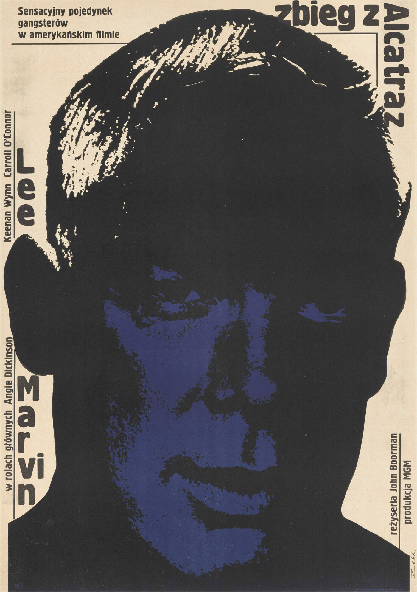
I argue a lot with filmmakers about the immediacy of a piece of work. Unfortunately, at some point everyone has to put their marketing hats on, and when they do so they always get hung up on one thing: how quickly (read: how obviously) is this piece of work communicating what we want to say?
I've also had this Polish poster for John Boorman’s Point Blank among my clippings for years, not being able to explain why it is I liked it so much. The cut-out and heavily darkened facial features with the bright background seemed simply like a beautiful aesthetic choice, perhaps something to do with Lee Marvin’s character’s darker psychology or what have you. Years later it hit me that because the Poles had renamed the film Escape from Alcatraz, Marvin’s face was darkened because it was a graphic illustration of Marvin peering out from a dark place, a tunnel or a prison.
Sometimes the immediacy of an idea isn’t as important as how beautifully you depict it. One way or another your audience is taken in, and then in time they’ll come to love the work in new ways—and the film with it—as the poster can often more slowly reveal its thinking.
10. French poster for Juliet of the Spirits (Federico Fellini, Italy, 1965). Designer unknown.
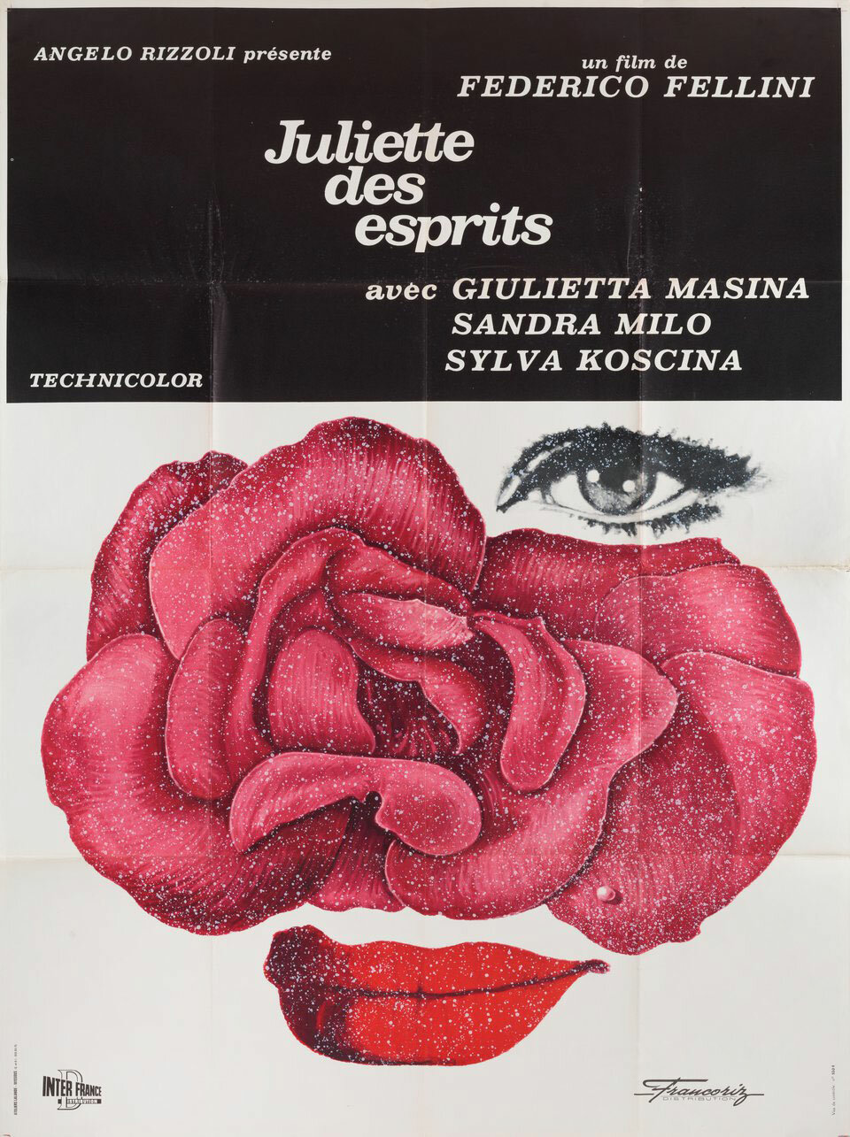
I’ve not seen Juliet of the Spirits yet but I bought an original 47 x 63 print of it for my partner. Suffice to say, the specks of paint you can see all over the surface of this poster catch the light beautifully when hung on the wall, and the whole poster is printed on a nice thick canvas-y paper that feels almost like a fine sandpaper to the touch. The experience of having this image that big and printed with special materials is rewarding. You really don’t need another image in the room at all.
Technically speaking, the use of a flower, a leaf, and a pearl to articulate the beauty, mystery, and magic of a woman’s face is something I’ve tried again and again to succeed at in my own way. The closest I think I’ve come is with my poster for So Young Shelly Yo’s Smoking Tigers (2023). Regardless, this poster speaks again a universal language that leaves moot the question of whether or not you need to have seen the film to enjoy the work.
AND TEN RUNNERS-UP
Polish poster by Maciej Kalkus for Fatal Attraction (Adrian Lyne, USA, 1987).
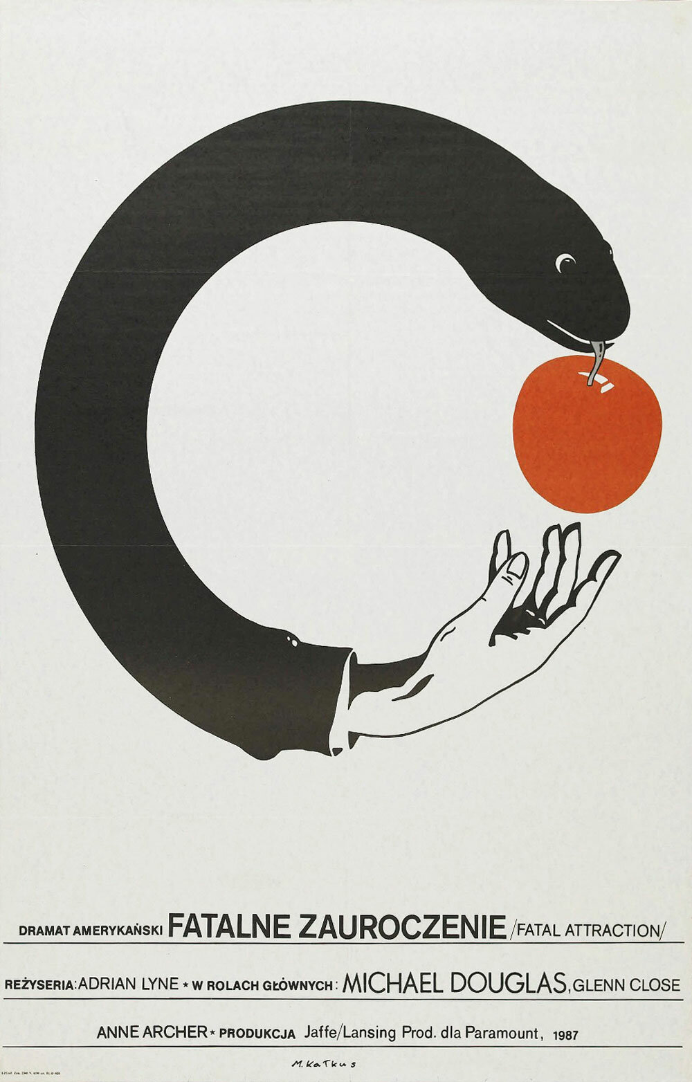
People, filmmakers and otherwise, quite rightly talk a lot about the greatness of Polish film posters. Amongst filmmakers specifically there’s talk about how much they’d like a poster like that for their film one day. To that end, Polish film posters are often included in the selection filmmakers send to me as inspiration for the poster we’re about to work on together.
The truth, however, is that nine times out of ten no one in any filmmaker’s marketing or distribution team would ever have the courage to use a poster as unique, out of left-field or as brave as Polish film posters so often are. The strength of conviction it takes for all involved to put out a poster as striking, thought-provoking, and charming as this Fatal Attraction poster is beyond the reach of more people than any of us would imagine—I challenge anyone and everyone to prove otherwise.
Polish poster by Waldemar Świerzy for Midnight Cowboy (John Schlesinger, USA, 1969).
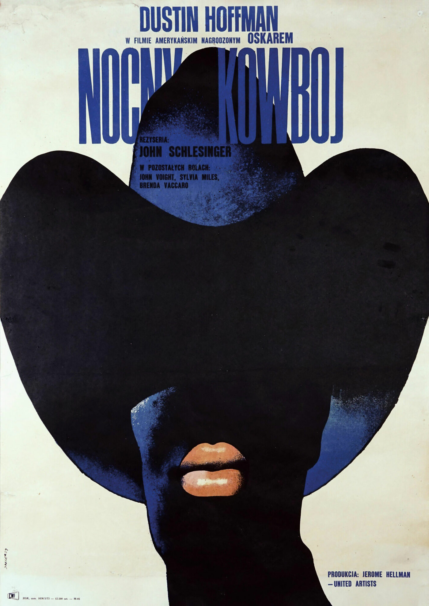
It’s true: The young Jon Voight did have great lips. He was likely cast as a male prostitute in this film, ahead of other actors, for that reason. Waldemar Świerzy clearly liked Jon Voight’s lips too. He also understood that the shadowy face, the dark blue cowboy hat, and that big red pout would say everything you needed to say about this film. Everyone knows this poster too, and for good reason.
Czech poster by Milan Grygar for Blow-Up (Michelangelo Antonioni, Italy, 1966).
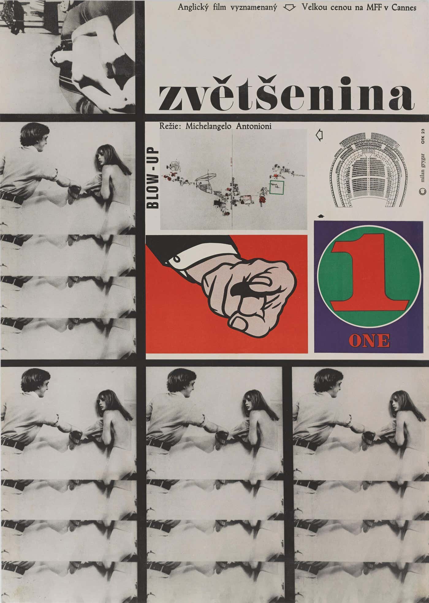
I’ve seen Blow-Up a few times and I’m still not entirely sure what I’m looking at on this poster, or how directly each part relates to the film. Nevertheless, I’m always taken by its Piet Mondrian overtones, seemingly absurd juxtapositions, and respect in many ways how it visually represents Antonioni’s own mantra: “A film that can be described in words is not really a film.”
Italian poster by Raymond Savignac for The Devil, Probably (Robert Bresson, France, 1977).
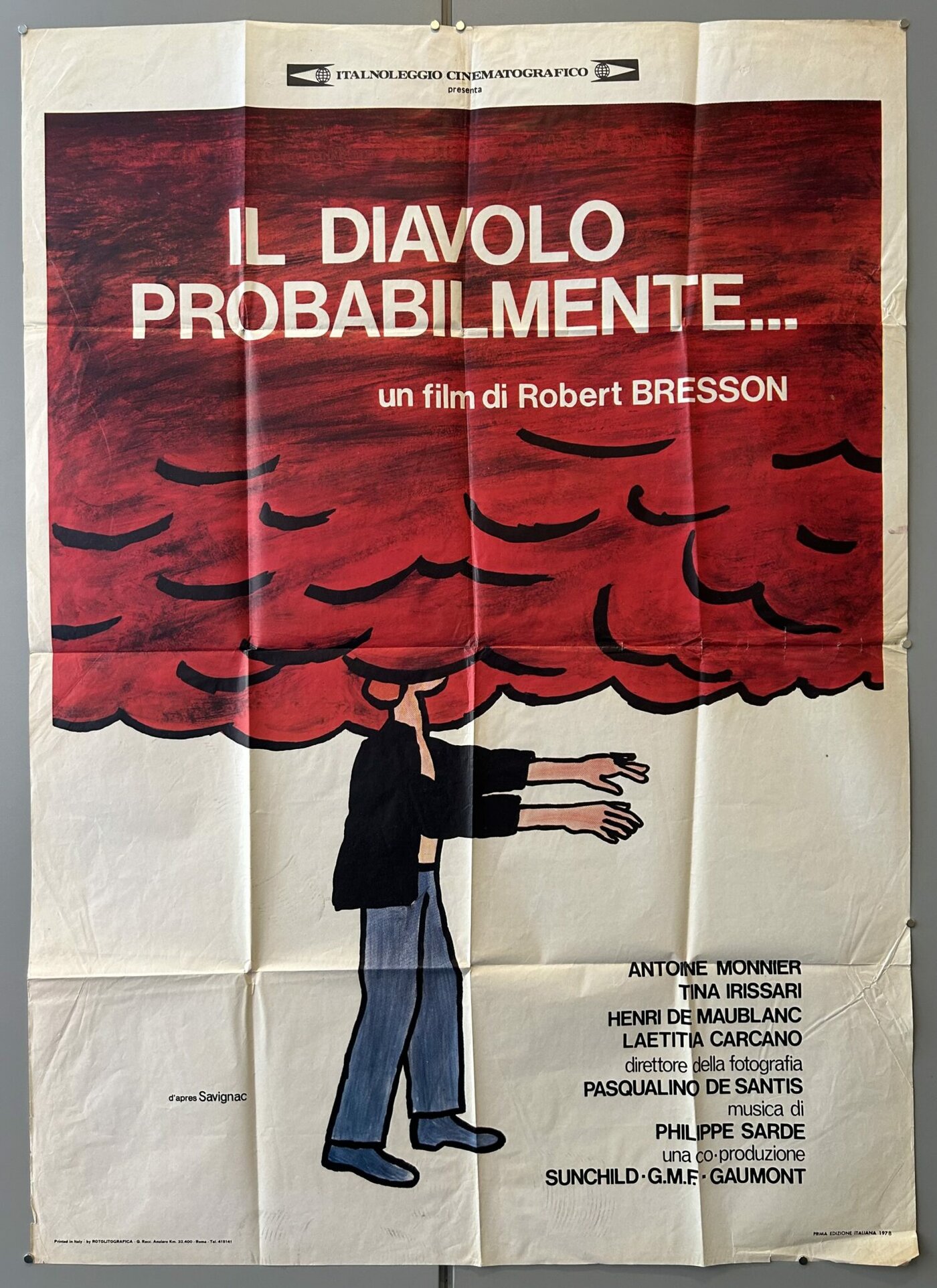
More evidence of the seemingly brief but powerful collaboration between the French poster-maker Raymond Savignac and director Robert Bresson. The image speaks boldly, humorously, and poetically to the viewer, regardless of whether you have seen the film. However, to those that have it’s touching to once again see a deeply serious film—about a boy whose disillusionment with society and its horrors results in his desire to be executed—get a painterly cartoon treatment.
But what I especially love about this particular image of the poster (a photograph of an Italian variant of the French original) are the folds and creases. A question that regularly comes up between my collaborators and I is whether we can apply a paper texture to the poster to make it look as if the poster was printed on paper. The unfortunate, tacit truth is that the poster we’re making together may never actually be printed on paper, and that it will likely only ever make it anywhere in digital format, on the internet.
The graphic designer David Rudnick adopted a smart policy seemingly from the very beginning of his career to present all his poster work with a specific paper texture that he designed, so that you could both imagine his posters printed—as they often were—but also understand that they were intended for print, and not simply to linger in digital format in your Google searches. This level of forethought is remarkable and puts the work of contemporary poster-makers such as Braulio Amado in perspective in terms of the publication of the portfolio and how best to go about it.
Where relevant, I now adopt a policy to try to achieve the effect in the image above. I print out the poster, fold it up in various ways as seems fit and photograph the result against a flat background. I then make that photograph the final poster. The fact is that effect of the folding puts the poster at a level of remove from the viewer that gives the poster an added weight. It’s a skeuomorphic dimension that strangely seems to help the audience feel the work has a more timeless quality, and therein a greater authority. A little white lie.
Polish poster by Ryszard Kiwerski for Heroin (Horst E. Brandt and Heinz Thiel, 1968).
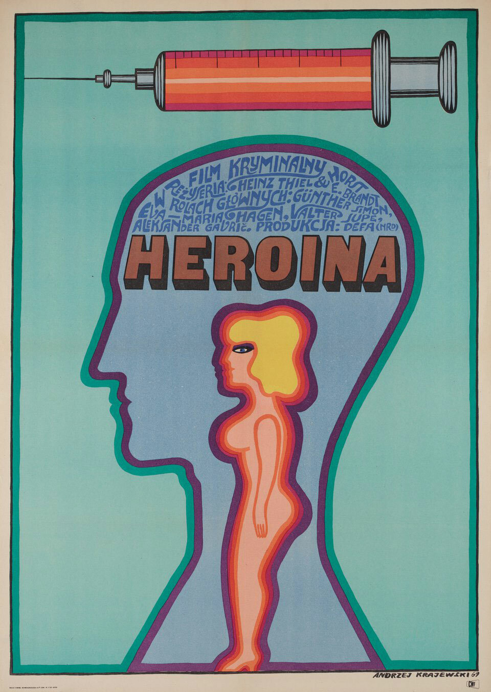
In their scans of the brain scientists have proven there’s a direct link between falling in love and addiction to drugs. Effectively the same part of the brain gets inflamed in both scenarios; whether in love or heart broken, on a drug or suffering withdrawal. This poster says all of that in one, whether you’ve seen the film or not, and in that sense does what I feel a great poster should do.
That said, I chose this poster also because of the colors. I tire regularly of the garish, attention-grabbing tones of most posters these days. I long for color palettes like this that try less to demand your attention and try more to blend comfortably into the background of our lives. Despite its grim, graphic subject matter, you could see this poster on your wall for 20 years. Its tasteful hues would complement your plants, your bookshelves, and your sleeping animals. The sacrifice of such marketing-minded immediacy for a longevity that allows the message of the work to be delivered to generations of people is also something to strive for.
Soviet international poster by Igor Pavlovich Lemeshev for Come and See (Elem Klimov, USSR, 1985).
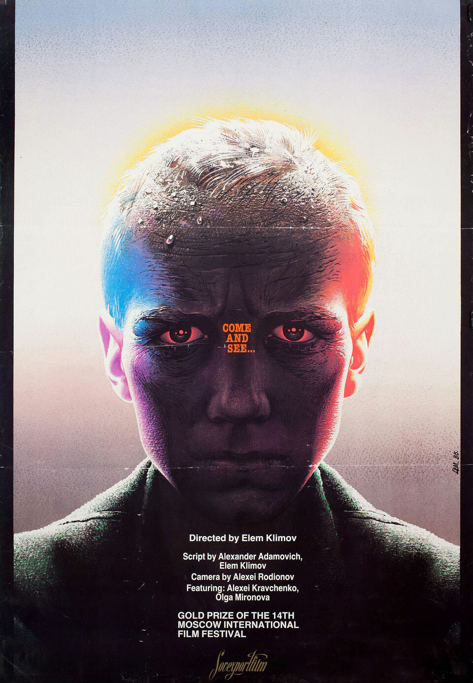
I’d seen this poster in passing for some time, always curious about what it was for. It was so clear, confident, and striking to me that I longed one day to see the film it spoke of. I particularly liked the poster’s unusual use of pillarboxing at the sides of the design to create an immediate feeling that the boy was opening a door to us, or that we were opening a door to him.
In 2016 I began working with cinematographer Shabier Kirchner on my first film, and in the process of getting to know each other’s aesthetic interests he told me Come and See was his favorite film. Naturally I then gave him this poster a wrap gift for the beautiful work he did for me. Oh, and I have also now seen the film. Good god.
German poster by Hans Hillmann for Muriel (Alain Resnais, France, 1963).
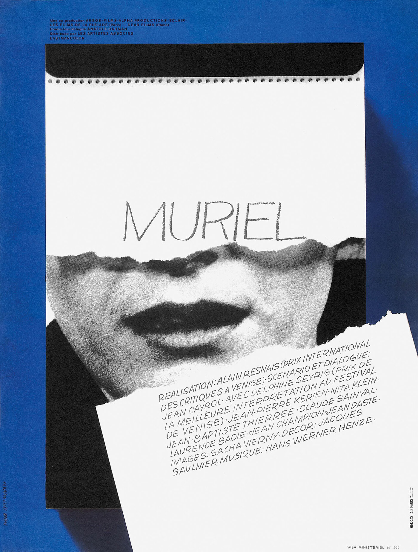
As above with Saul Bass’s Exodus poster, here we have another master of his craft showing how you can tastefully create a feeling of movement in a poster, without any stupid effects. Cutting up a person’s face to make an impactful image is one of the oldest tricks in the book, but doing it with the timeless simplicity and graphic freshness exhibited here isn’t as easy as it looks.
US one-sheet by Bill Gold for The Rain People (Francis Ford Coppola, USA, 1969).
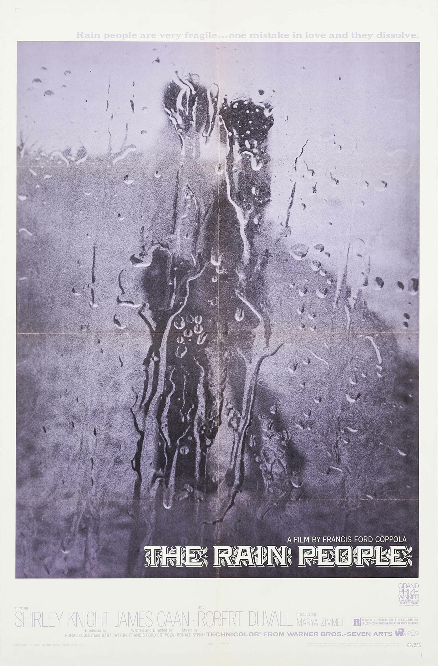
I’ve never seen this film so I can’t say whether this is a still from the film, or whether it’s simply a wonderful idea conceived by Bill Gold . Either way, it’s an image that speaks volumes and has regularly inspired me to photograph my posters in the bathtub or behind glass or wet up against a wall—again, using only that final photo as the poster.
Polish poster for A Trap for the General (Miomir Stamenković, Yugoslavia, 1971). Designer unknown.
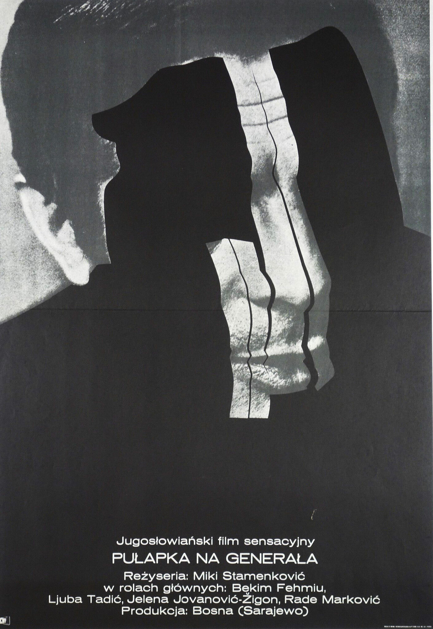
As with Muriel above, posters like this make it look easy. However, I have tried and failed to make an image as suggestive as this one. One half of its power is in the use of the bottomless black void and everything that human eyes and minds read into such a thing. The other half is in the Francis Bacon-esque choices made in those scalpel cuts, and the massive contrast between the big type and the tiny type in the corner. These tricks with depth, obfuscation, and scale make the poster feel like it’s personal, alive, and towering above you.
German poster by Hans Hillmann for Rashomon (Akira Kurosawa, Japan, 1950).
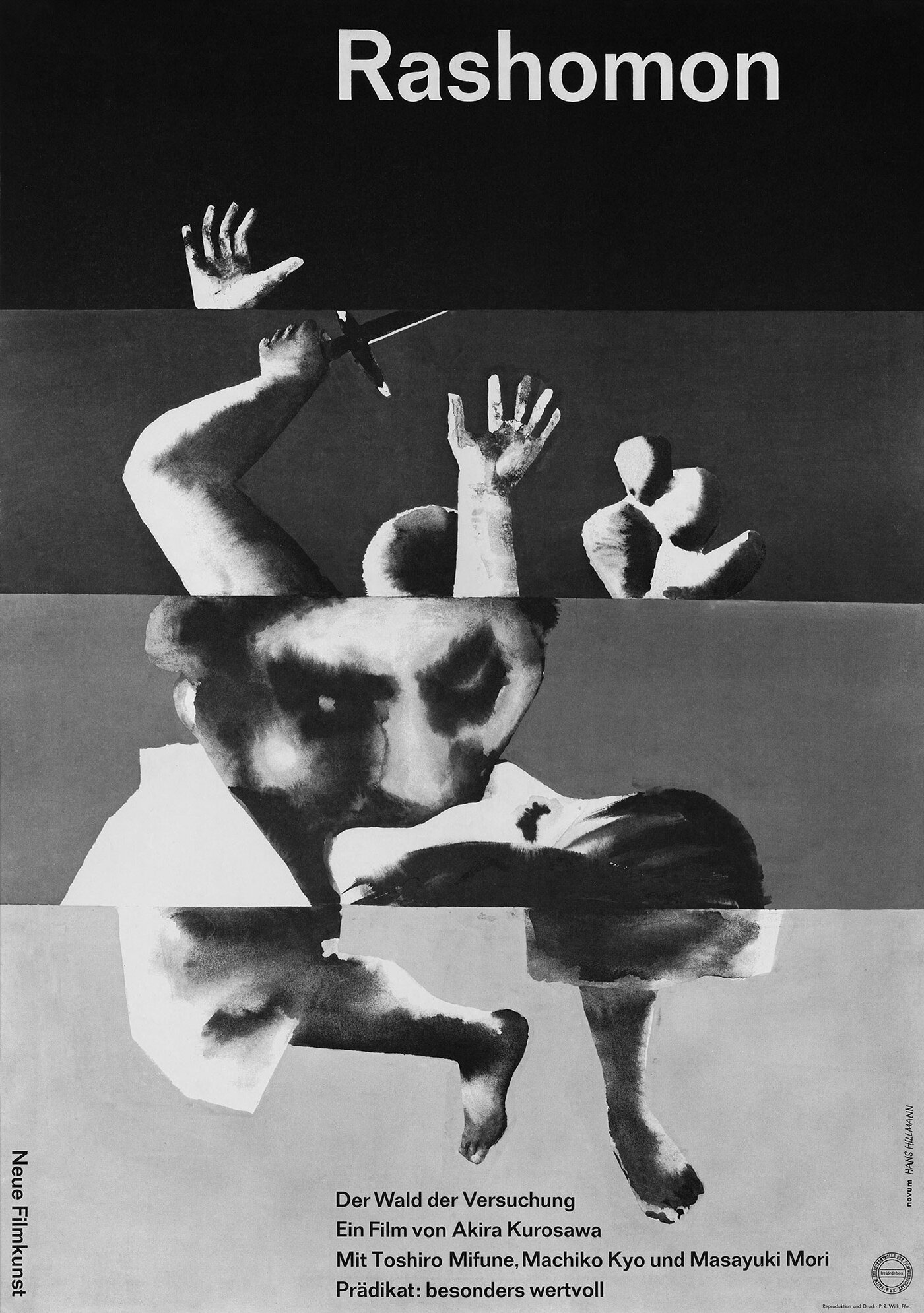
Last but not least, this is Hans Hillmann’s poster for Kurosawa’s profound, allegorical Rashomon. The poster, like the film, offers several different points of view on the same event. In the case of the poster, fragments of each event are cut together with the next to make a shattered picture of a man and a woman in a particularly violent, flailing embrace. In this way the poster speaks both directly to the film’s narrative and plot, but also more broadly about the wiles of human memory.
However, it’s the confidence of Hillmann’s watercolor painting that brings this one home. In every way it feels cinematic and photographic, and yet there’s no photography to be found. I remember very well the first time I saw this poster and how my heart started racing. It’s really those single works of art that you both admire and yet feel you somehow could have done yourself, that propel you toward a greater mastery of the craft.
It took me some years to find a high enough resolution copy of this poster in order to enjoy its finer details. Thankfully you can now see this image here, and many more of his works, on his incredibly thorough and beautiful archive.
You can see more of Caspar’s own equally thrilling and convention-defying work on the Version Industries website.
And in Notebook’s Movie Poster of the Week archives, you can find previous top ten selections from designers Dawn Baillie, Scott Bendall, Maks Bereski, Nathan Gelgud, Midnight Marauder, Vasilis Marmatakis, Jay Shaw, Sam Smith, Akiko Stehrenberger, and Antonio Stella.