The posters in my list this year are those that do what any poster worth its salt should do: they stopped me in my tracks. These days those tracks are less and less likely to be along a city street or even inside the lobby of a multiplex and more likely to be on a virtual stroll (or scroll) through a streaming service or social media feed. The received wisdom is that this will result in a dumbing down of poster design, leading to work that is less complex and easier to take in in a one-inch high thumbnail. In other words, more big heads. But the 30 posters below, most of which I likely saw first on a phone screen, give the lie to that doomsday prediction. They are posters that not only work on first glance but reward repeated viewing. In other words, you could hang them on your wall. One footnote: there are a lot of pairs in this year's collection, partly because I couldn’t fit all my favorites into a top ten, partly because I love graphic coincidences, and partly because two of a kind is sometimes better than one.
1. Riotsville U.S.A.

I’ve been writing about the posters of Brian Hung for a while now, but this came as a surprise. Brian’s specialty, for the past few years, has been creating an ongoing series of posters for Cinema Guild for the films of Hong Sang-soo. So when this knockout poster came out for a Magnolia Pictures documentary, I wasn’t immediately aware that it was his work. I should have known though: the dominant title treatment, the infographic-style tchotchkes, the perfect balance between detail and space, and the simply impeccable execution. I’m not sure this poster tells you everything you need to know about Riotsville, U.S.A.—which is an archival doc about a model town built by the American military to practice the quelling of inner-city riots in the late ’60s—but it is certainly enough to make you want to know more. As I said in the preface to an interview with him last year, I have known Brian for many years, ever since he worked as an intern at Zeitgeist Films. I was the design director there but Brian hid his graphic talents under a bushel. Our loss was Cinema Guild’s, and Magnolia’s, gain.
2. The Act of Coming Out and We’re All Going to the World’s Fair

Another designer I have interviewed recently is Caspar Newbolt of Version Industries who, as I said back in July, has for the past ten years been stealthily creating some of the most adventurous, expressive, and unusual film posters out there. It was this beautiful and unique poster for the short film The Act of Coming Out that prompted me to contact him, but his deceptively lo-fi design for the online horror movie We’re All Going to the World’s Fair is also one of the year’s very best, especially in its motion version in which the design comes eerily to life. (Do click on the posters to see them much larger on your screen.)
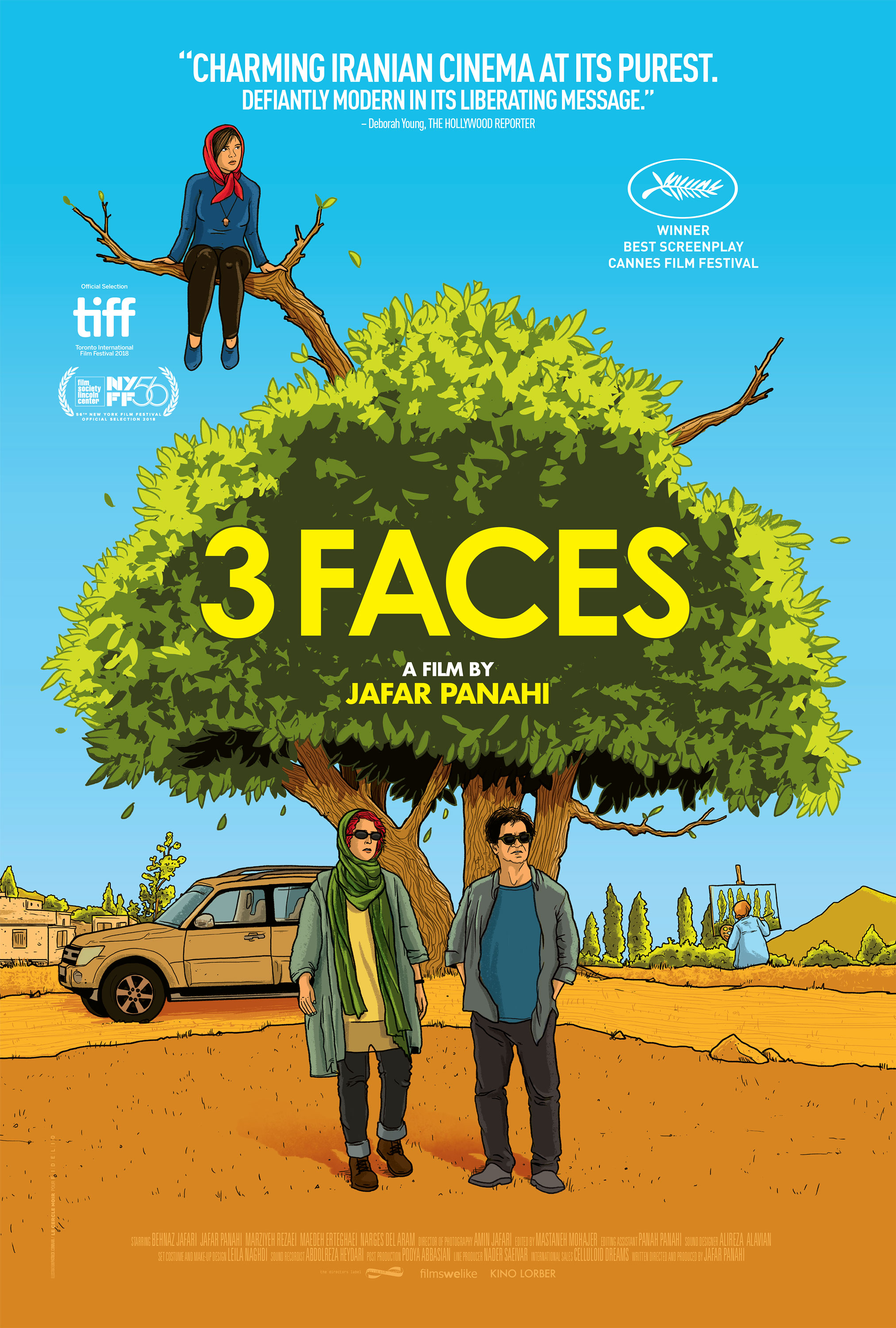
3. No Bears and Hit the Road

This pair was a no-brainer: two of my favorite fully illustrated designs of the year (there are surprisingly only a few others on this year’s list) just happen to be posters for the newest film by the great Iranian director Jafar Panahi and the feature debut of his son, Panah. Jafar’s No Bears premiered (and won the Special Jury Prize) at the Venice Film Festival in September less than two months after he had been sentenced to six years in prison by Iran’s judiciary after inquiring about the detention of fellow director Mohammad Rasoulof, a sentence that had been originally handed down in 2010 for participating in antigovernmental protests. Despite receiving a twenty-year ban on filmmaking in 2010, No Bears is Panahi’s fifth film made since then. His last three, including Taxi and Three Faces, have all been promoted with similarly wonderful cartoonish and colorful illustrated posters; the newest one is by Federico Mazza. For Panah’s film, Hit the Road, I designed the photograph-based US poster and I was very happy with it, but I wish I could draw the way the artists at the South African design studio MUTI can. They have illustrated the UK quad poster for Panah’s brilliant, bittersweet road movie with an arresting panorama of character and incident that is even more resonant once you have seen the film.
4. Corsage and On the Line

Two of the most elegant, uncomplicated, and striking posters of the year, by two of my favorite and most consistently accomplished contemporary movie poster designers: Midnight Marauder and Akiko Stehrenberger. Their two subjects—Empress Elisabeth and King Richard—stand starkly silhouetted, one photographed, one painted, against empty backgrounds accompanied only by their accoutrements: a floating crown for Sisi and not one but two tennis racquets (a simple but brilliant touch) for Richard Williams. The use of type is faultless too but I wouldn’t expect anything less from these designers.
5. EO

A terrific festival poster for Jerzy Skolimowski’s Au hasard Balthazar reboot that was thankfully barely changed for its theatrical release (unlike Corsage). This little donkey stood out from the pack at Cannes and also has my favorite title treatment of the year, though the hair-splitting graphic designer in me wishes it wasn’t so close to EO’s muzzle. Design by Aneta Gebska and Filip Gebski.
6. Till and Emancipation

Two of the best photography-based posters of the year (designed by Empire Design and BLT Communications respectively) are, coincidentally, for two films that center on the extraordinary impact of a photograph. And in both cases it was a photograph reproduced around the world as evidence of the brutality of American racism. In the case of Emancipation the image in question was an 1863 photograph of the scarred back of a former slave who became known as “Whipped Peter.” Published in Harper’s Weekly and widely circulated, the image helped turn Northerners against slavery during the Civil War. Emancipation details Peter’s escape from a Confederate work camp and the harrowing journey that led to that photograph. In the case of Till the photograph was that of the brutalized body of 14-year-old Emmett Till who was abducted and murdered in Mississippi in 1955. After Emmett’s mother Mamie insisted on having an open casket at his funeral, a photograph of Emmett’s mutilated body published in Jet magazine and The Chicago Defender once again dramatically exposed American racism nearly 100 years after Whipped Peter, and galvanized the Civil Rights Movement. Both of the photographs haunt these posters' striking, unadorned images of love and defiance. Again, the type (and the restraint in terms of the amount of text) is what makes them extra special, especially the bold sans serif, edge-bleeding title of Till.
7. Elvis and Dear Mr. Brody

You only have to look through this list to know I love minimalism in movie poster design; I’m a big proponent of less-is-more. But there is always a place for a little maximalism and these posters pull that off with the reticence of a horde of screaming Elvis fans. The flipside to the biopic portraits of Corsage and On the Line, these posters are jam-packed with frou-frou and filigree and are just beautifully done. The Elvis poster is one of three similarly bedazzled designs by Concept Arts, while the poster for the documentary Dear Mr. Brody was designed by Matt Frost of Frost Foundry, and, knowing Matt as I do, I’m sure he drew every ornament by hand. Definitely click on these two to see them in more of their glory.
8. Neptune Frost

I am always hesitant to put posters that I have a personal connection to on this annual list, but this poster by Xan Black, which I art directed at the start of the year, still stops me in my tracks when I come across it online, and I take little credit for it. Xan, whom I first found our about when they appeared on a Zoomcast with the aforementioned Akiko during lockdown, is an incredibly talented Brooklyn-based freelancer who also works as the in-house designer for film consulting company DEDZA. A Rwandan Afrofuturist cyber-musical full of outré imagery, Neptune Frost was both a daunting challenge and a designer’s dream. Xan’s poster flirts with the tower-of-heads iconography of Marvel movies, but renders it in red, black, and blue, making it more haunting and more unique. One sign that this project was meant to be is that Xan’s Instagram handle, @d.owntown81, is named for their favorite film, the lost-and-found 1981 Jean-Michel Basquiat film Downtown 81 for which Basquiat’s lost dialogue was dubbed 20 years later by Saul Williams, the co-creator of Neptune Frost.
9. Earwig and Downton Abbey: A New Era

The UK quad for Lucile Hadžihalilović’s Earwig, designed by Laurent Lufroy, and a faux travel-poster teaser for Downton Abbey: A New Era created by Katie Hearns for AV Squad. Either could have been in my Top Ten, but they look even better side by side.
10. Aftersun

Just because this column is published by MUBI doesn’t mean that I shouldn’t consider their designs for their theatrical releases, especially when they are this good. This UK quad, for the loveliest movie of the year, Charlotte Wells’s Aftersun, was designed by Intermission Film and MUBI LAB and is another poster whose simplicity belies its perfection. More subtly affecting than A24’s US poster which shows a father and daughter sitting on a beach with their backs to us, this casual, awkwardly framed holiday snapshot, folded as if treasured in a wallet for years, captures the sad charm of this gem of a film much more perfectly. And bonus points for the truncated lower case Helvetica title treatment sitting on the fold like a setting sun.
14 Runners-up (in no particular order beyond an aesthetic one)


Runner-up posters above designed or illustrated, where known, by AV Print (Everything Everywhere All at Once), Midnight Marauder (The Year Between and Friends and Strangers), Leroy & Rose (Blonde), Adrian Tomine (Paris, 13th District), Alejandro Pasquale (El Tiempo Perdido), P+A (I Love My Dad), Brandon Schaefer (To the Moon), Andrew Bannister (Lynch/Oz), and MUBI LAB and Intermission (Decision to Leave).
If anyone knows who designed the others please let me know in the comments below.
You can see my all previous Best of the Year posts here: 2021; 2020; 2019; 2018; 2017, 2016; 2015; 2014; 2013; 2012; 2011; 2010; 2009. And if you’re new to this site, do check out my regular (if not always weekly) Movie Poster of the Week posts on Notebook, and my daily Movie Poster of the Day posts on Instagram.